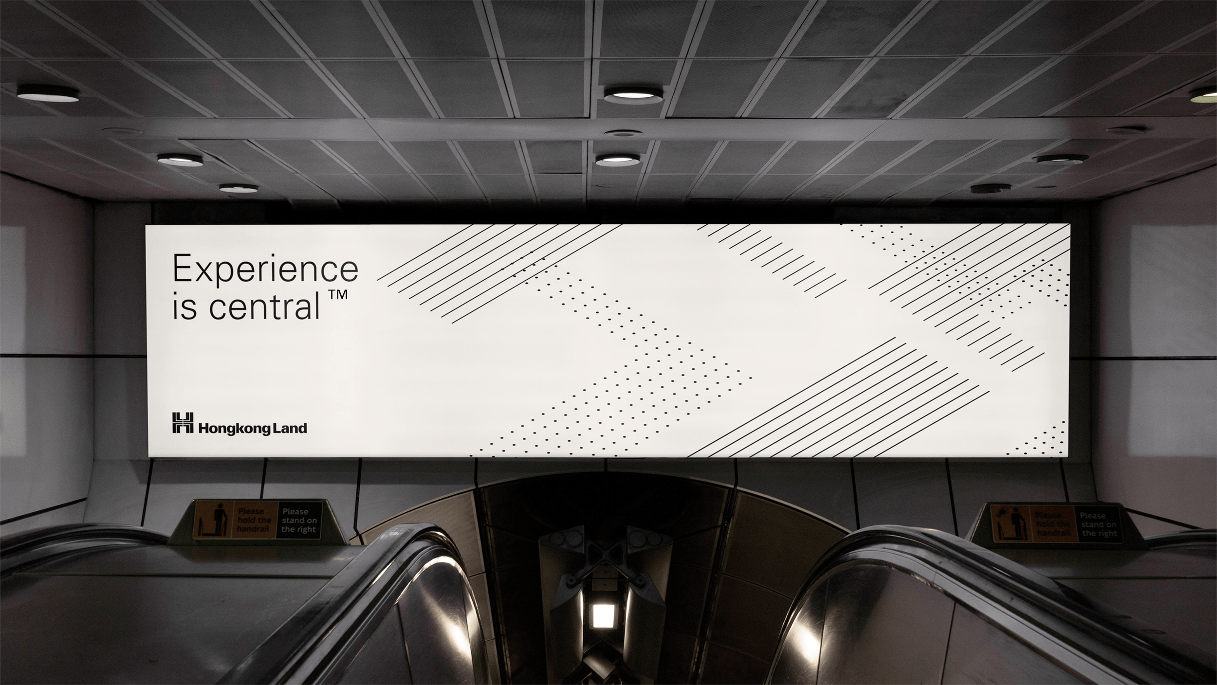
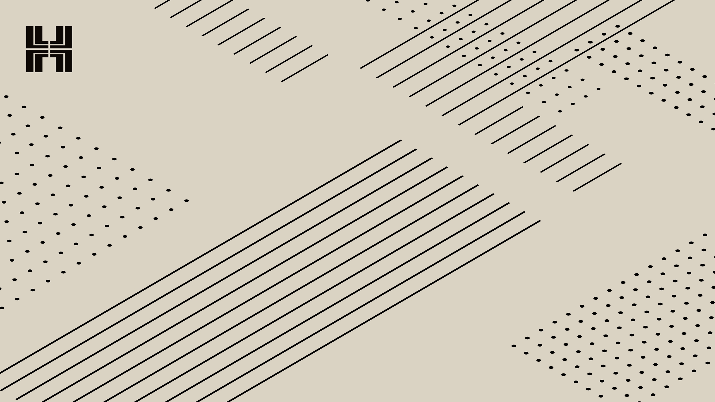
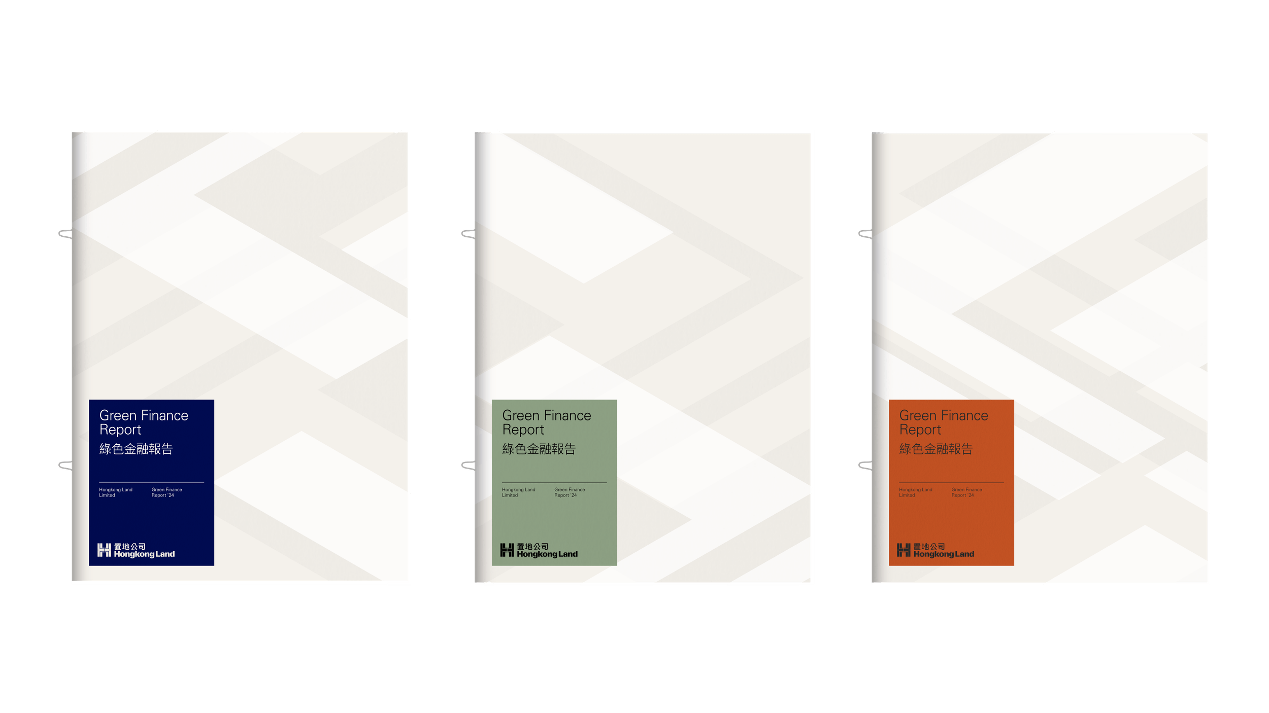
Pattern
Inspired by the pathways and points of connection in the city, our dynamic pattern system brings texture and vibrancy to our identity.
Pattern
Introduction
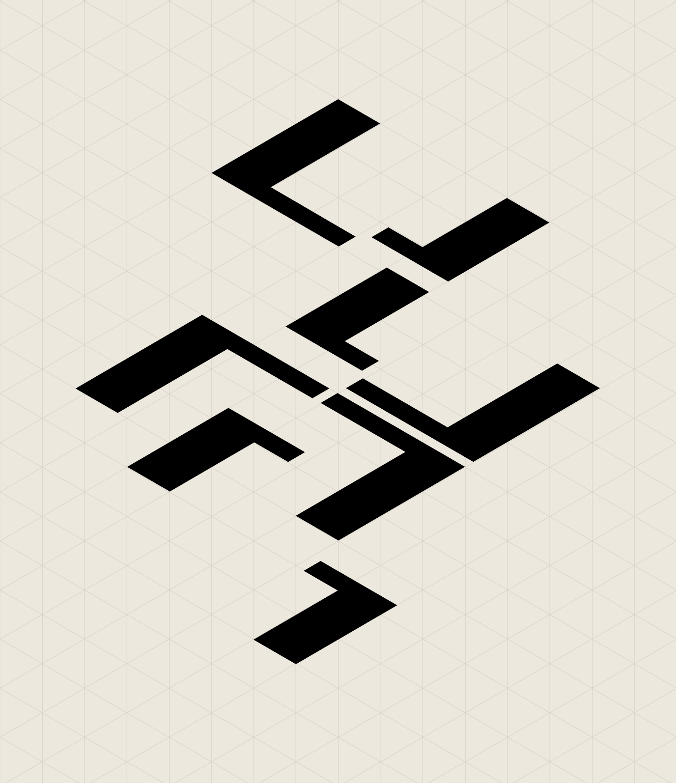
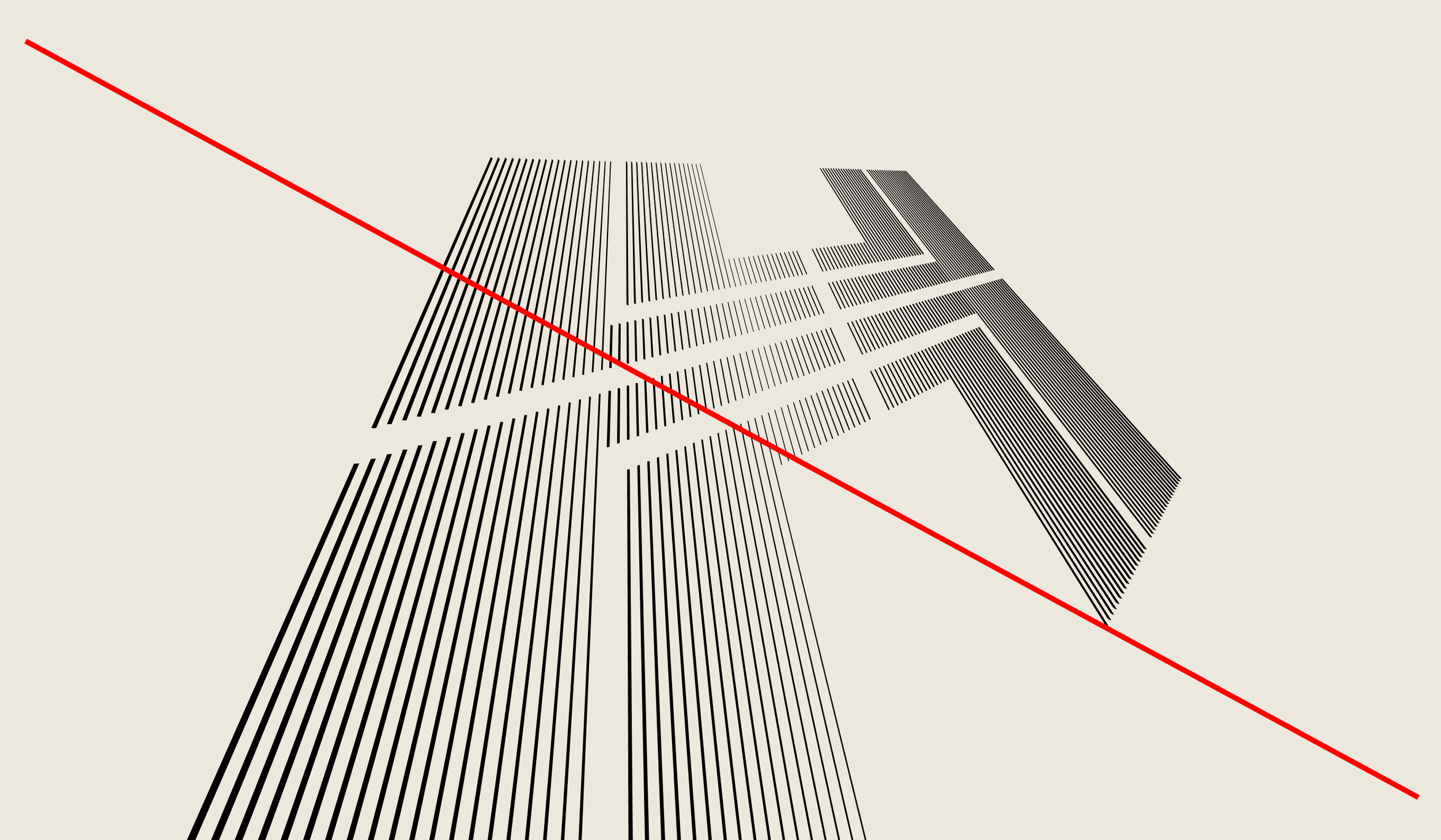
All patterns have been constructed from our symbol. By placing the symbol on a 30 degree isometric grid and separating the modules, we have a base to create endless textural applications for the brand.

Pattern
Pattern styles
To further extend the possibilities of our pattern language, three different styles can be utilised:
Textured pattern
Example

Solid pattern
Example

Perspective pattern
Example
Pattern
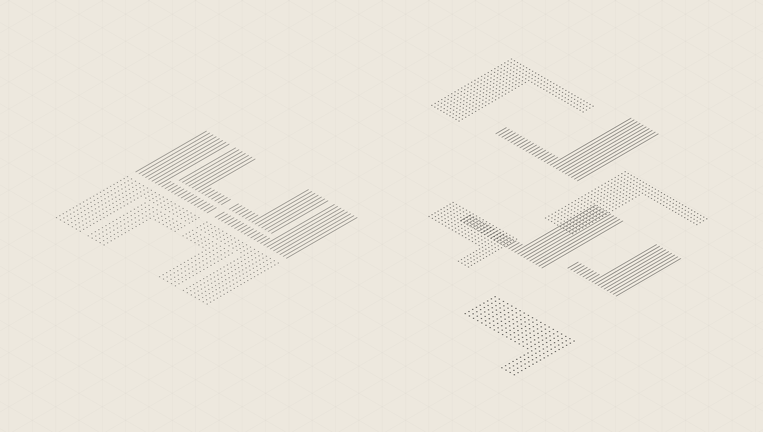
Textured pattern
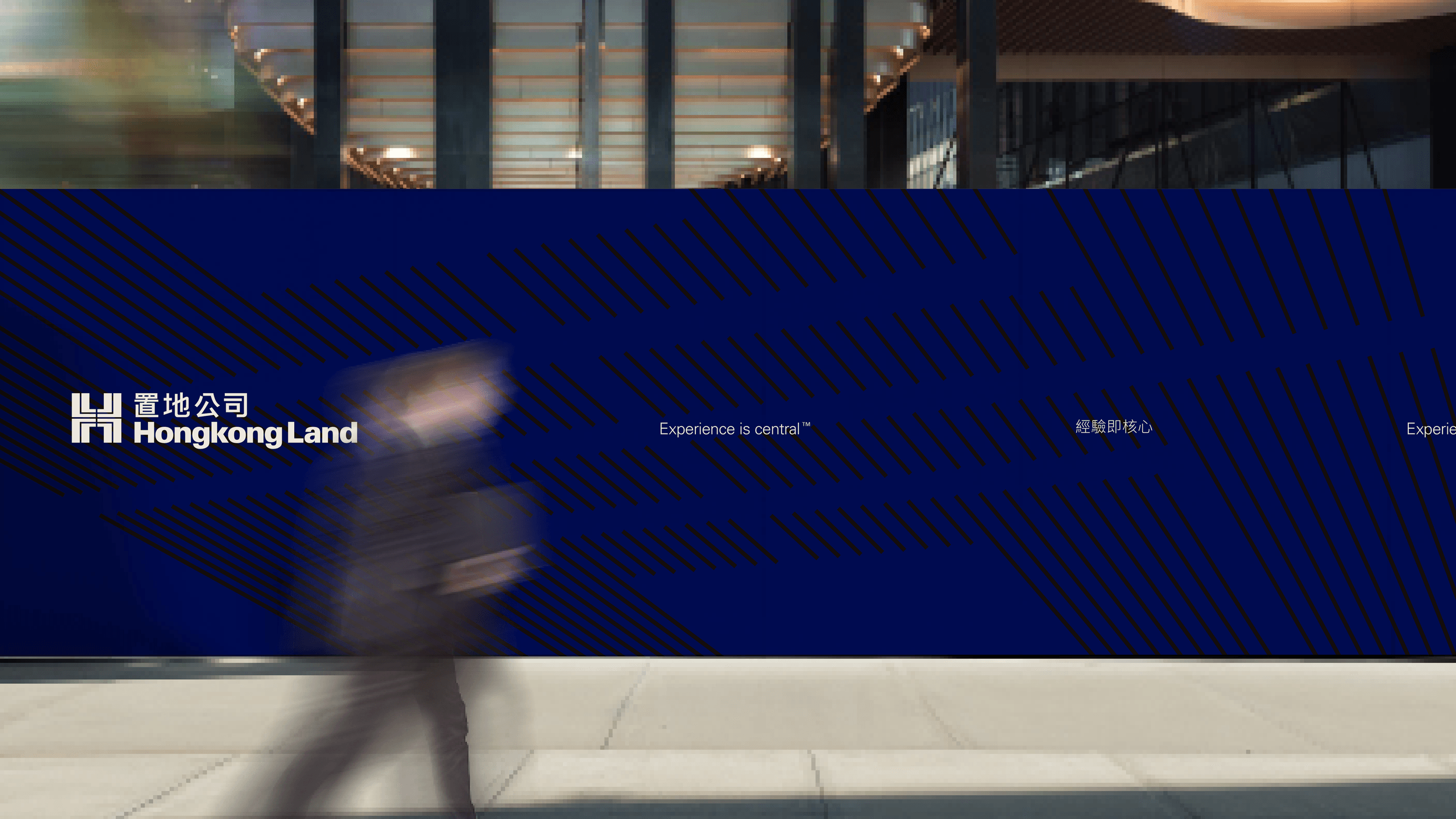
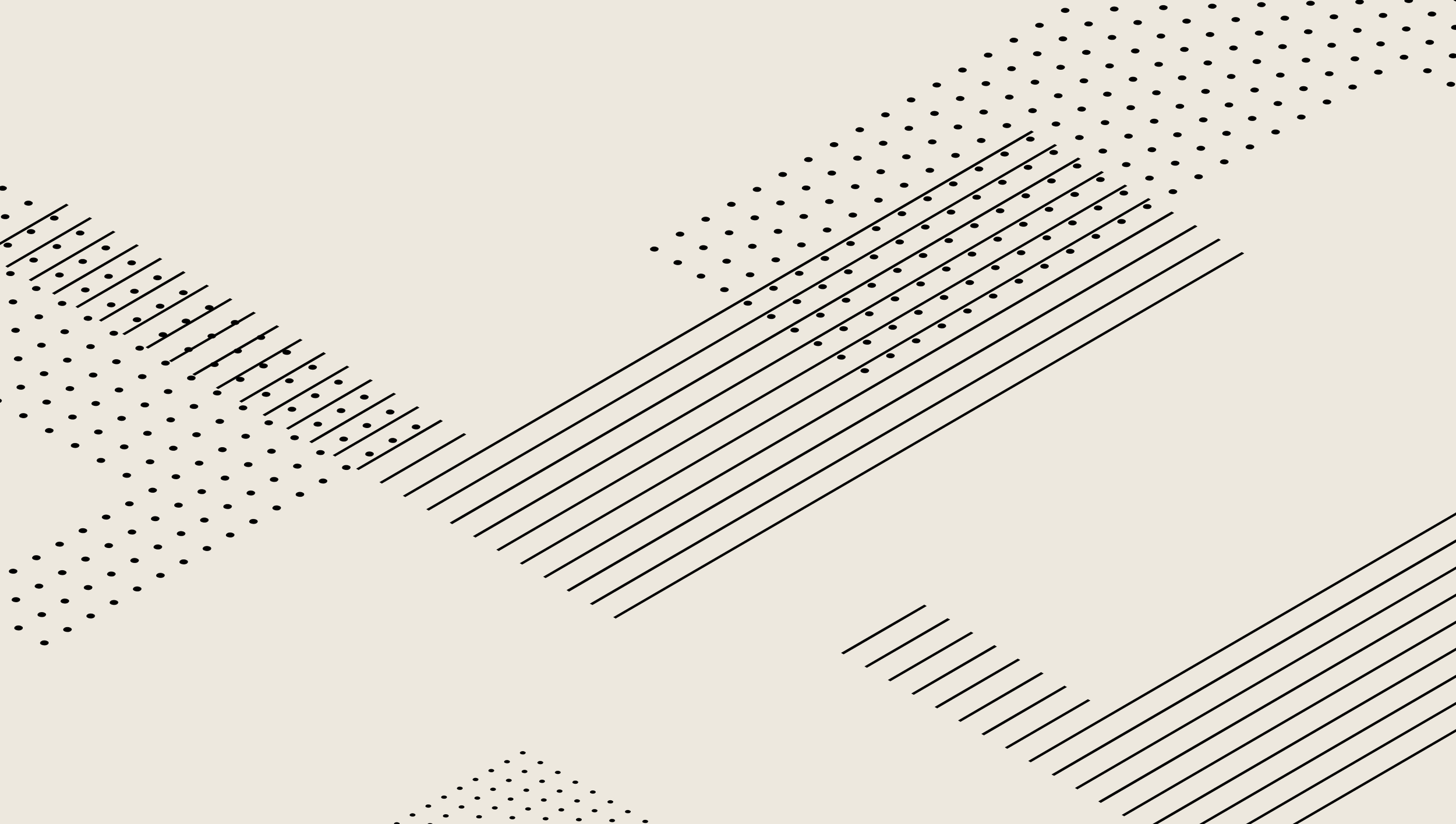
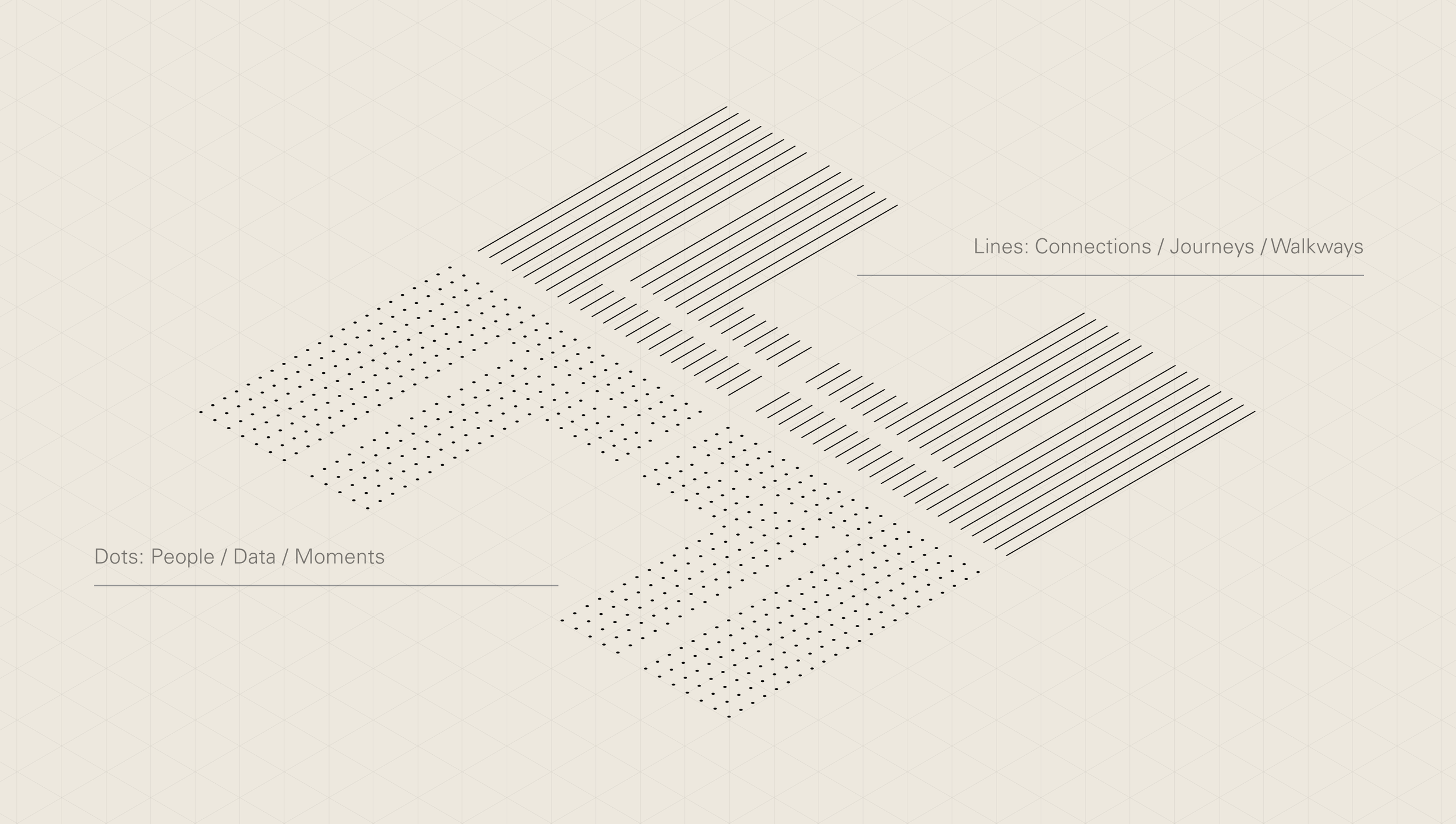
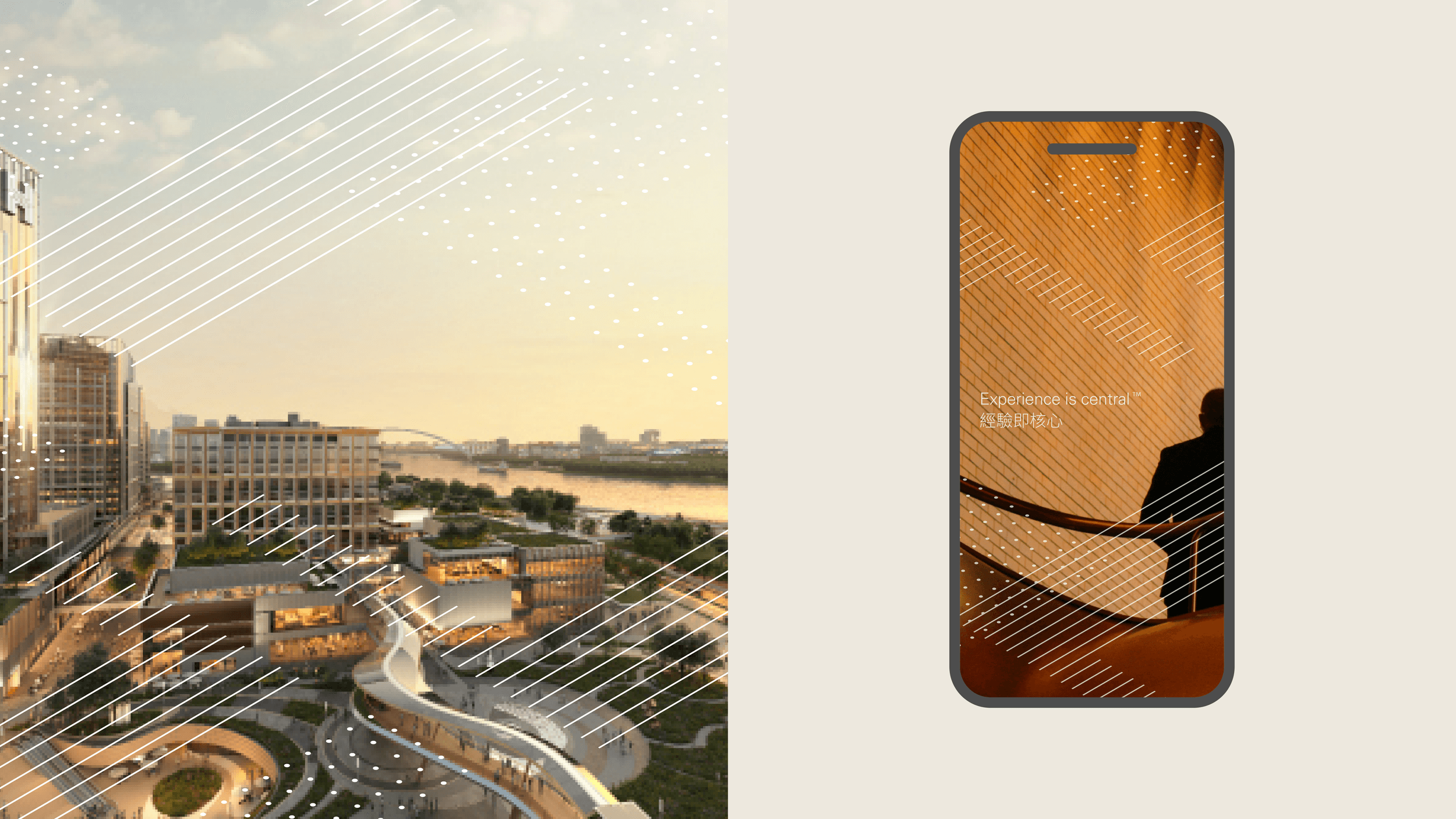
Applying texture to the symbol modules we are able to further communicate the idea of city life by representing people with dots, and pathways/journeys with lines.
Due to the gaps between the lines and dots, this style of pattern works well on top of imagery or plain colour backgrounds.
Textured Pattern
Construction
To build a pattern, the individual modules are separated on the X, Y and Z axis.
Textured Pattern
Colour
The prominence of the pattern can be adapted through the use of colour. All elements of this pattern should be used in one singular colour at a time.
The colour combinations for the textured pattern have been limited to ensure consistency throughout brand applications. Only use it in our neutral colour tones.
Black on neutrals


Neutral on accent colour
White on image

Misuse
Don’t apply an accent colour over imagery

Don’t apply black to the pattern over imagery

Don’t apply an accent colour to the textured pattern
Textured Pattern
Examples
Textured Pattern
Misuse
Don’t cover typography with patterns
Don’t leave clearspace around a pattern
Don’t overcrowd patterns

Don’t create patterns with a singular module

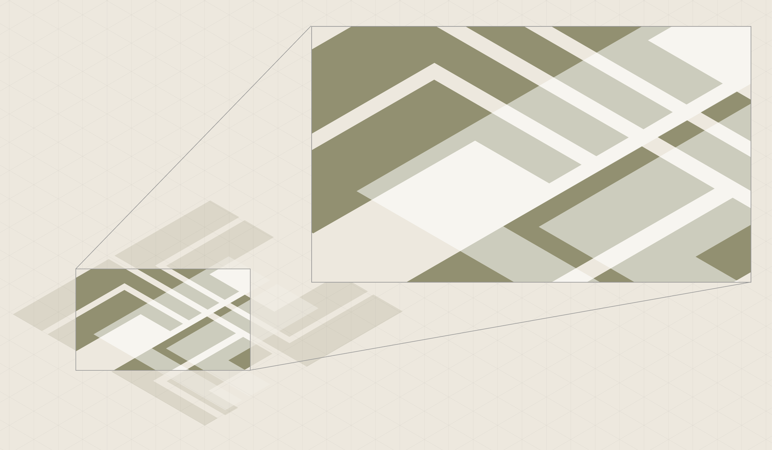
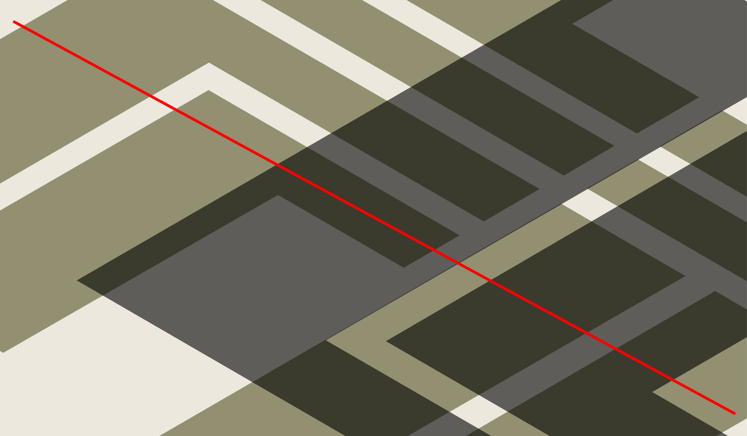
Pattern
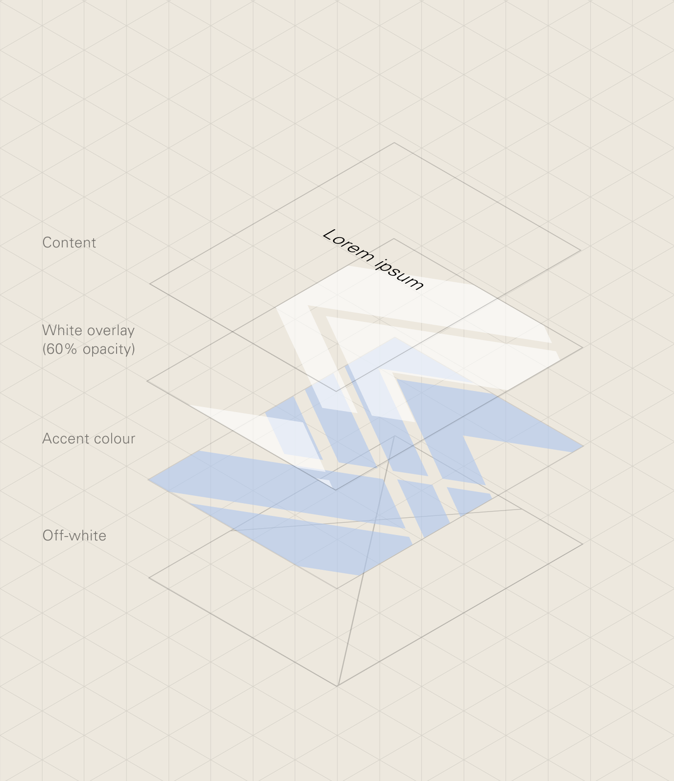
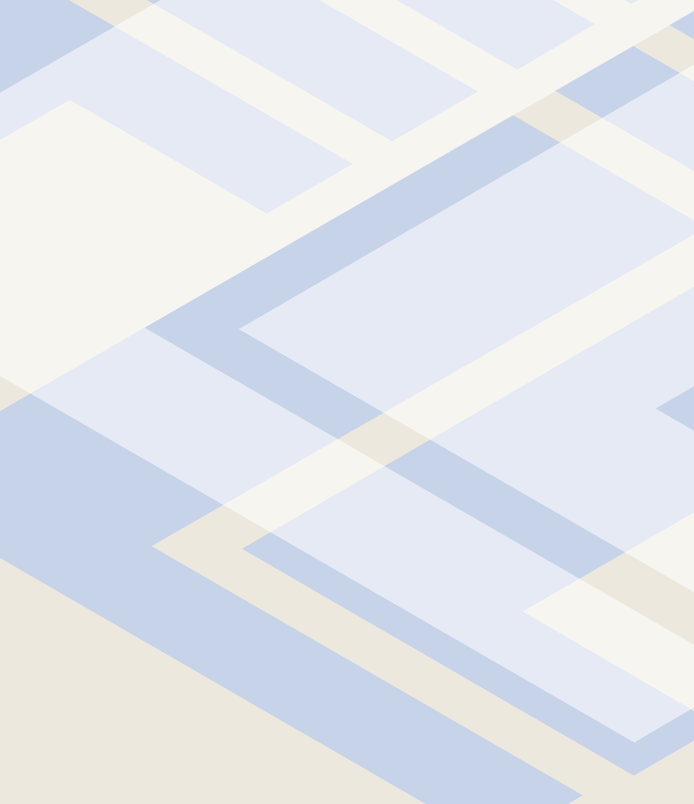
Solid
Solid patterns are made up of three layers. The off-white background, an accent colour layer and an white overlay with 60% opacity.
Solid pattern
Framing
These solid patterns more closely resemble our symbol, and use much tighter crops. These pattern shapes move around less compared to those in the textured pattern.
Solid pattern
Colour
Neutral tones

Accent colour

Solid pattern
Misuse
Don’t adjust the opacity of the overlay layer

Don’t apply an accent colour to the background
Don’t use any colour, other than white, to the overlay layer
Don’t apply the fill patterns over imagery

Solid pattern
Examples

Pattern
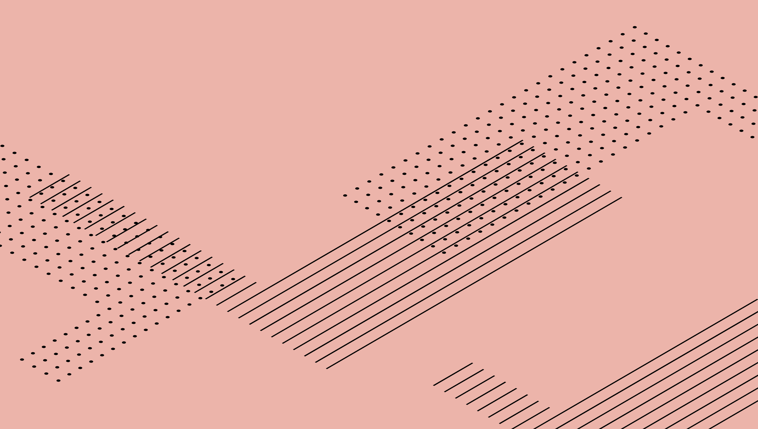
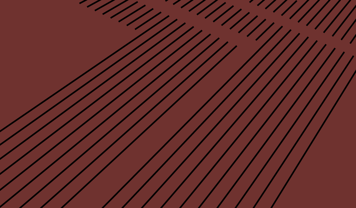
Perspective
Inspired by the perspective of skyscrapers from ground level, here our the symbol is filled with a line pattern and the orientation is manipulated within a 3D space.

Perspective pattern
Colour
Perspective patterns can be made more or less prominent through the use of colour. They are most often used in combinations that feel more subtle and tonal, this is achieved by altering the transparency of the lines.
15% opacity black on neutral/light accent colour
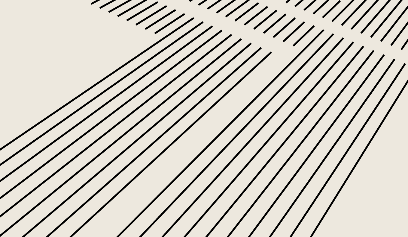
100% opacity black on dark accent colour
Perspective pattern
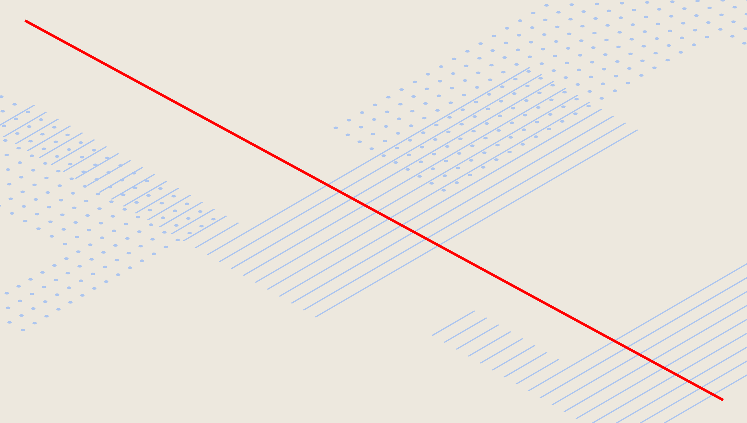
Misuse
Don’t leave clearspace around the symbol
Don’t set the logo too upright/straight-on
