Material palette
The materials used for our physical production will help build a brand that demonstrates excellence in the premium sector.
The materials should look and feel in keeping with the tonality of the Hongkong Land brand, and should be carefully considered to ensure we are creating a sense of luxury and attention to detail.
The photos in this document are not owned by Hongkong Land and are sourced from third-party providers for illustrative purposes only. Hongkong Land does not claim ownership of these assets and is not liable for any unauthorized use. Users must ensure proper licensing or replacement with proprietary assets for external applications.
Material palette
Overview
Much like the wider identity, we want to strike a balance between traditional craftmanship with contempary innovation. We look to be bold in our production, whilst keeping a sense of sophistication. We are aiming to build a materiality that feels premium, but not excessive.
Principle 1
Premium

Our brand is built by our many years of experience and this should be communicated in our production processes.
Principle 2
Layered

Our innvoation is multi-faceted and the production should reflect that. Layers can help tell a story in a way that adds depth.
Principle 3
Subtle
Our brand is bold, but it isn’t loud. We focus on the details and every decision is considered with a high level of thought.
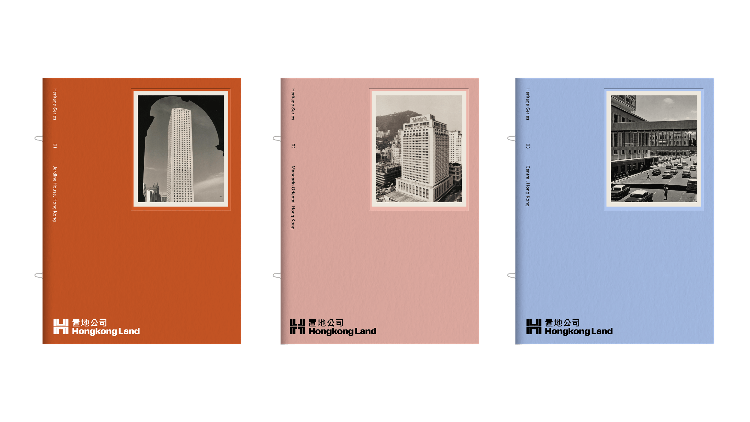
Material palette
Paperstock
Our chosen papers are carefully selected to closely match our existing color palette. They should be used consistently across all printed materials to strengthen the brand’s material identity.

GF Smith
Colorplan
Mist

GF Smith
Colorplan
White Frost

GF Smith
Colorplan
Azure Blue

GF Smith
Colorplan
Sapphire

GF Smith
Colorplan
Rust

GF Smith
Colorplan
Scarlet

GF Smith
Colorplan
Racing green

GF Smith
Colorplan
Chartreuse

GF Smith
Colorplan
Candy pink

GF Smith
Colorplan
Mid green
Paperstock
Envelope

Paper Conqueror
Diamond White Wove, 120gsm
DL – 220mm(W) x 110mm(H)
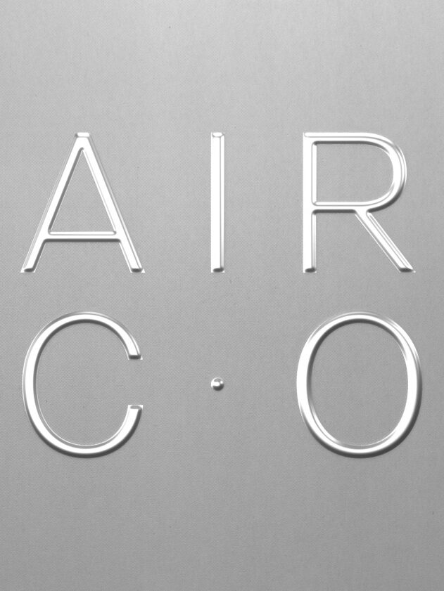
Material palette
Print processes
The print processes we use play a key role in enhancing the brand’s desired tonality. They add depth and sophistication to our materials, reinforcing the premium nature of the brand and aligning with the high-quality collateral we produce.

Embossing
The embossing process helps make printed matter feel elevated and considered. It allows us to make our mark on a material without disrupting or distracting from additional content.

Transparency
Explore how transparent/semi-opaque materials can be used to present the layered nature of our brand toolkit, in a way that is crafted and bespoke.

Foiling
When appropriate explore the potential of foiling, rather than flat colour printing. Foiling builds depth to our print production and elevates the value in printed matter.