Identity
Our identity is the result of the collective use of carefully considered assets. From narrative, through to visual assets, each element has been developed to work together to form a strong and distinctive brand.
Design principles
These are our design values and how we measure, benchmark and evaluate our design decisions.


Narrative
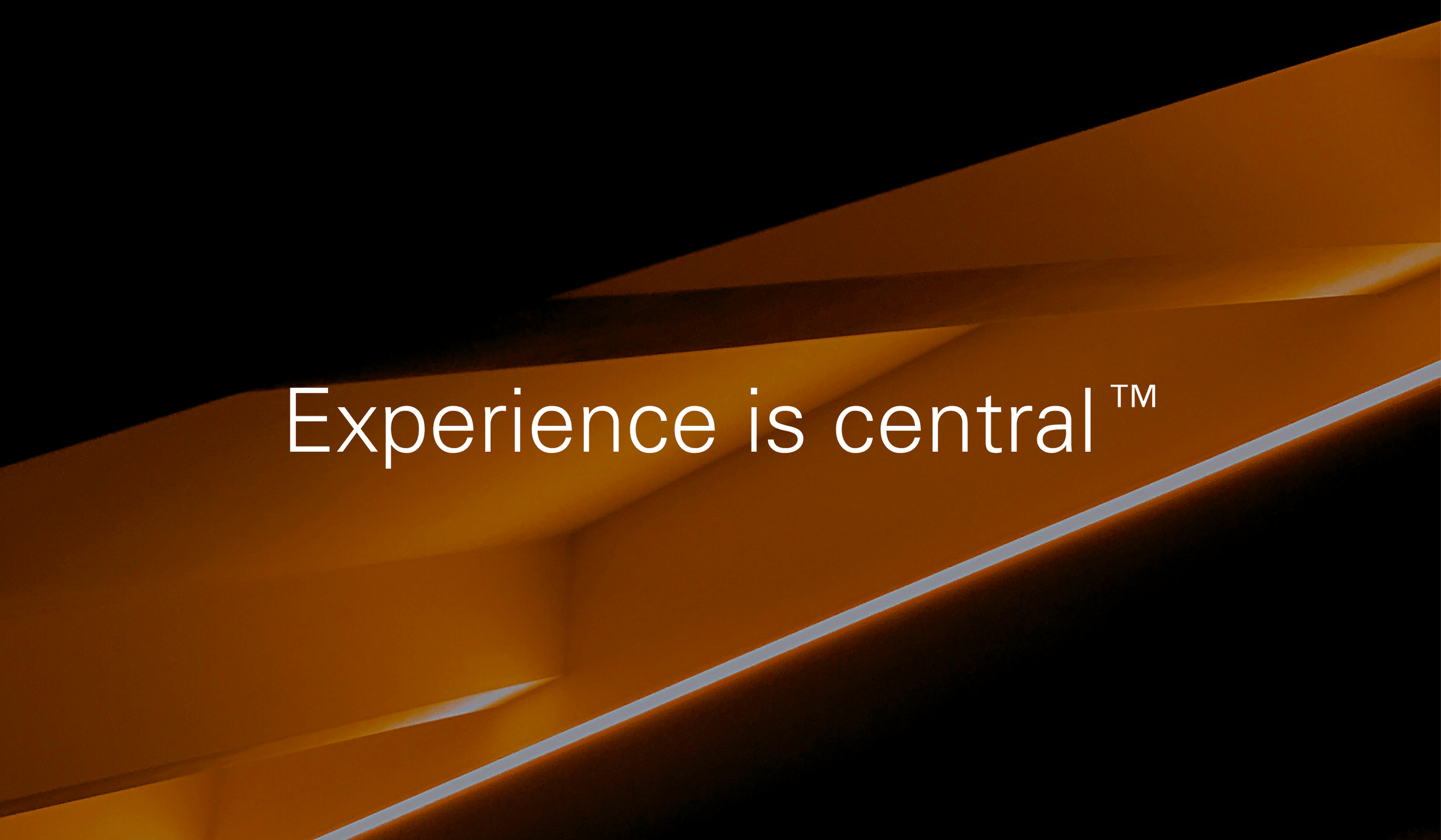
This is the story we tell the world — it maps out our vision, mission, values and key messages.
Logo
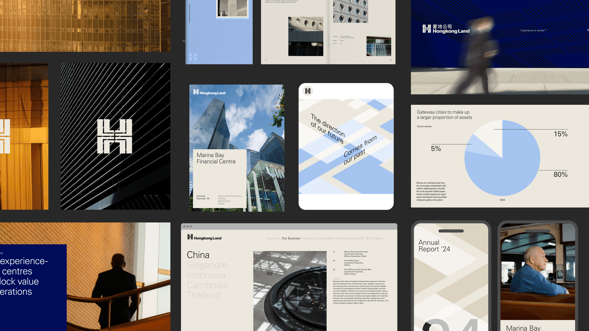
Our Hongkong Land logo stands as a timeless representation of our legacy and adapts to reflect our presence across Asia.
Symbol
Originally created by legendary designer Henry Steiner, our iconic symbol has been in use for over 50 years.
Typography
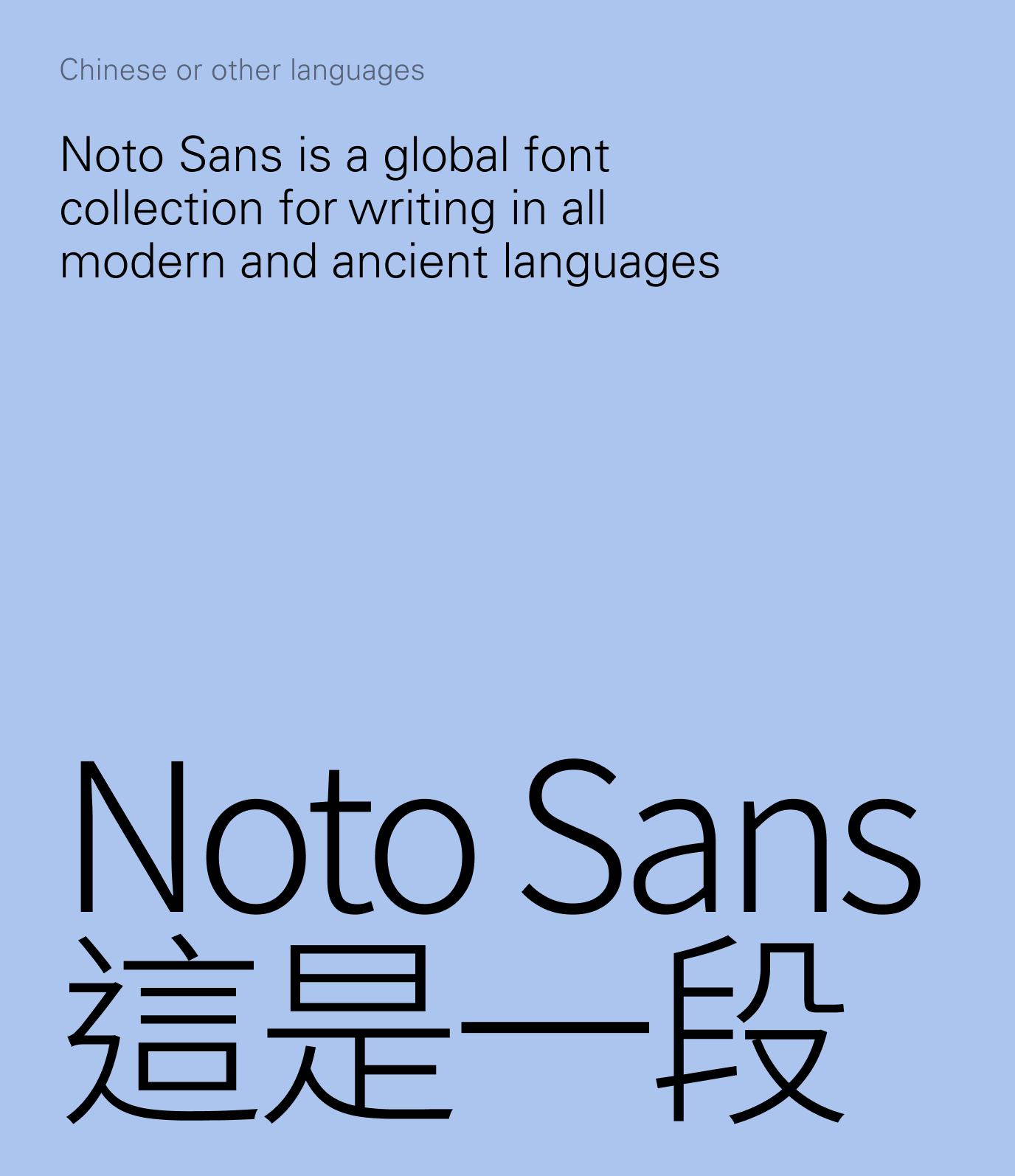
Our typography is simple and elegant. A combination of two typefaces that allow us to communicate in a huge number of languages.

Colour
Our colour palette embodies simplicity and elegance, with neutral tones forming its foundation. Additional bolder tones can be utilised as accent colours throughout the identity.

Layout
Our layout system creates a premium sensibility through the use of white space and attention to detail.
Pattern
Inspired by the pathways and points of connection in the city, our dynamic pattern system brings texture and vibrancy to our identity.