Typography
Our typography is timeless and elegant. The combination of two typefaces creates a system that allows us to communicate across many languages.

Our typefaces
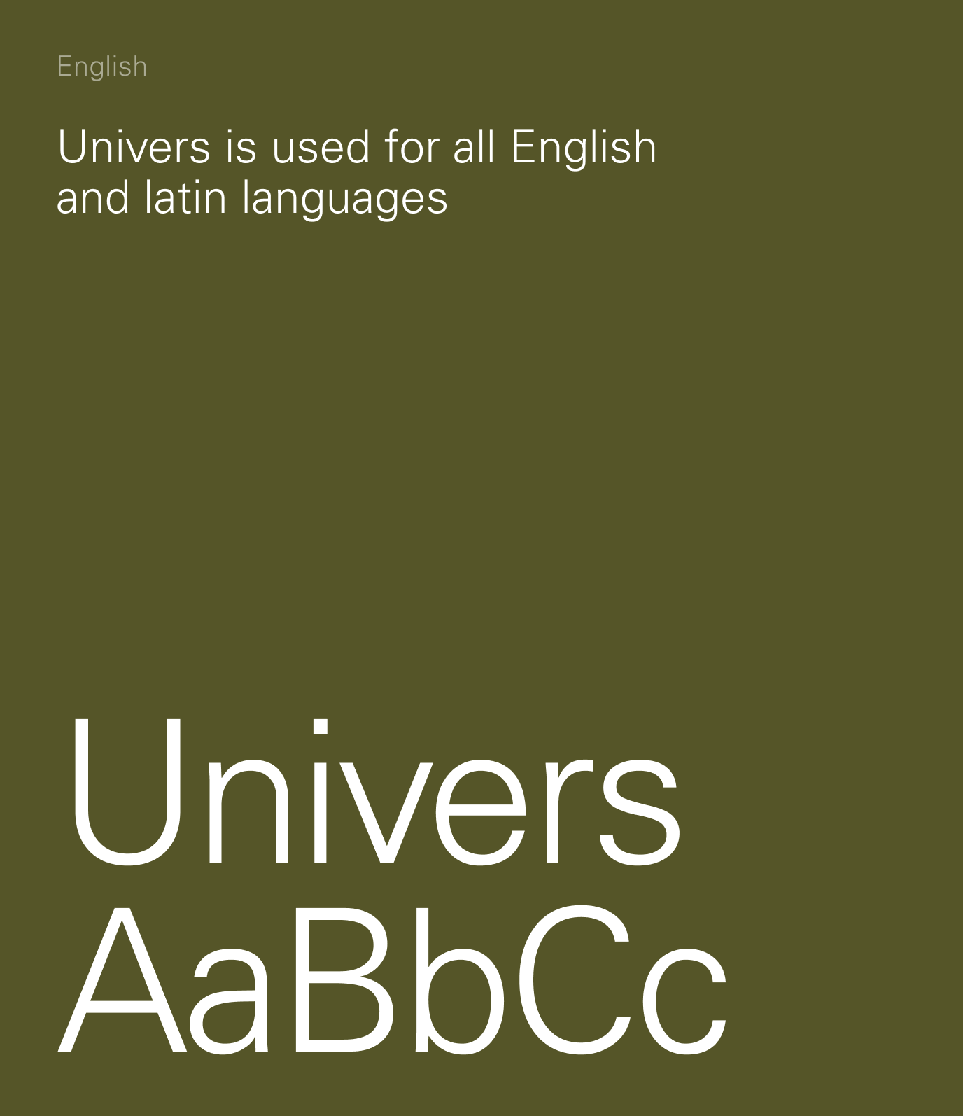
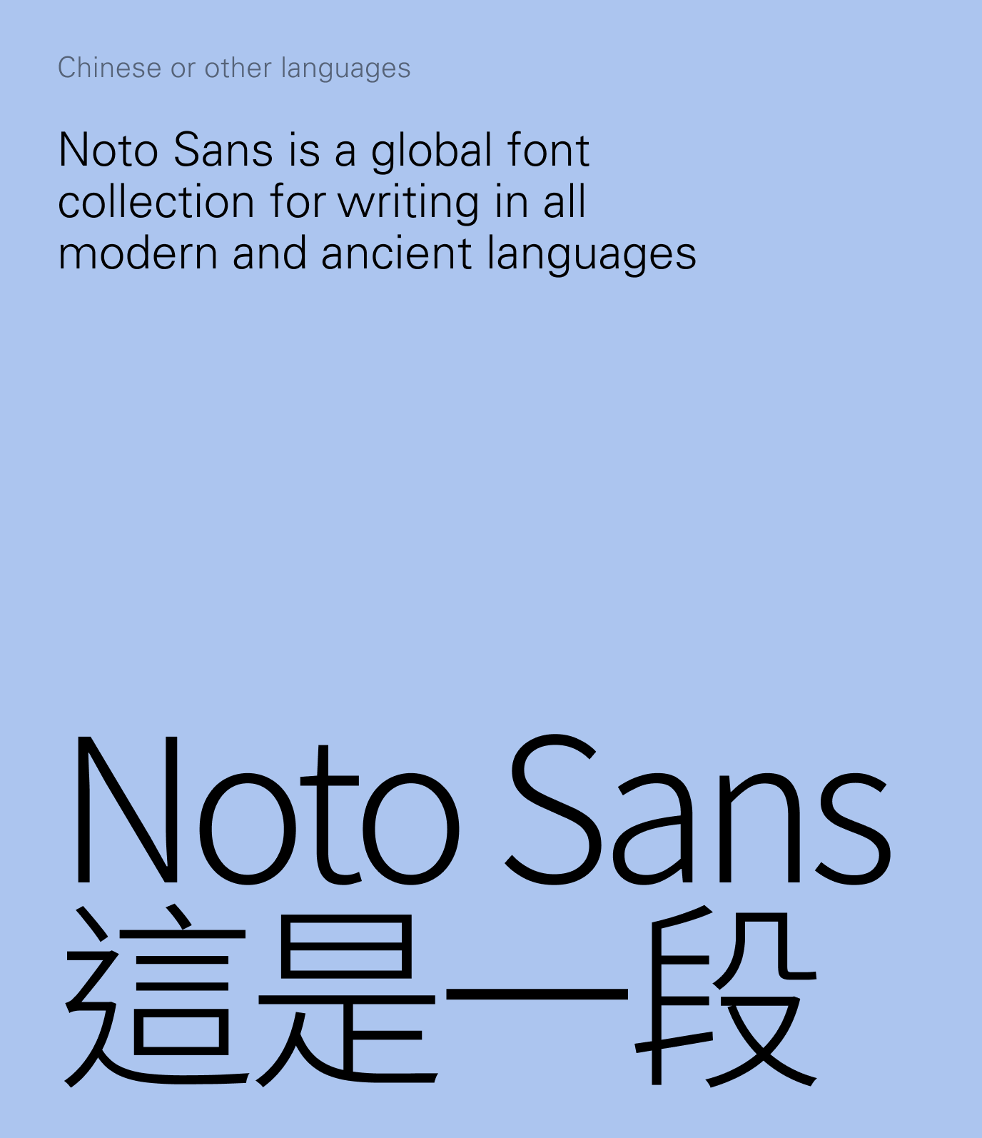
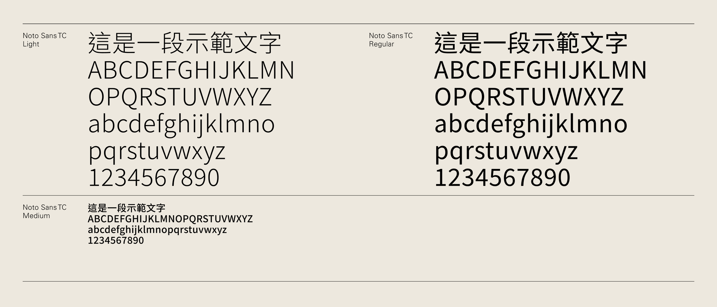
Univers links us with our heritage, whilst Noto allows us to communicate globally, with the typeface being available in over 1,000 languages.
Univers is used for English and all languages using the latin alphabet, whilst Noto’s global font collection should be used for all other languages.
If the typefaces below aren’t available on your computer, please contact corpcomm@hkland.com.
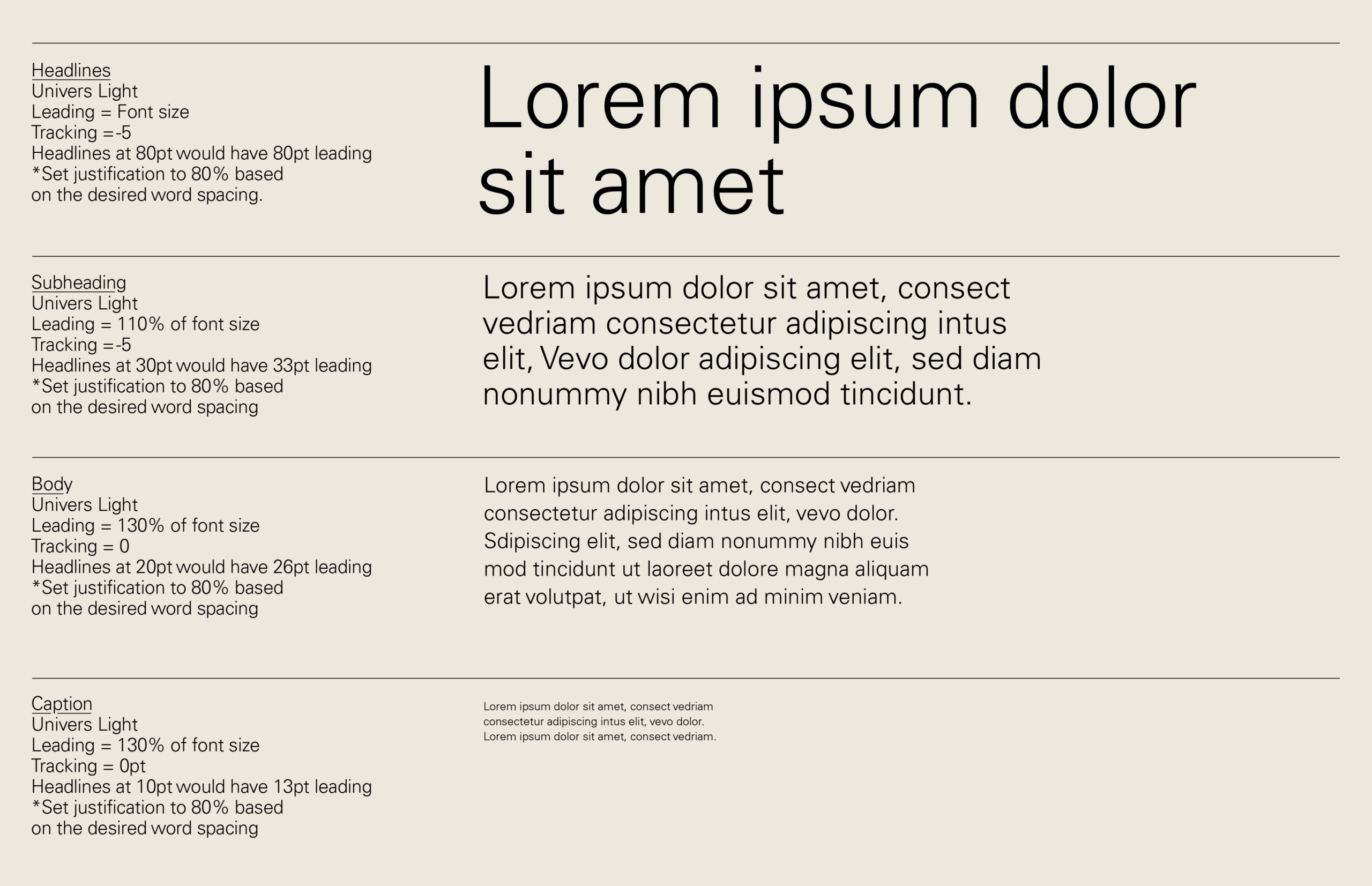
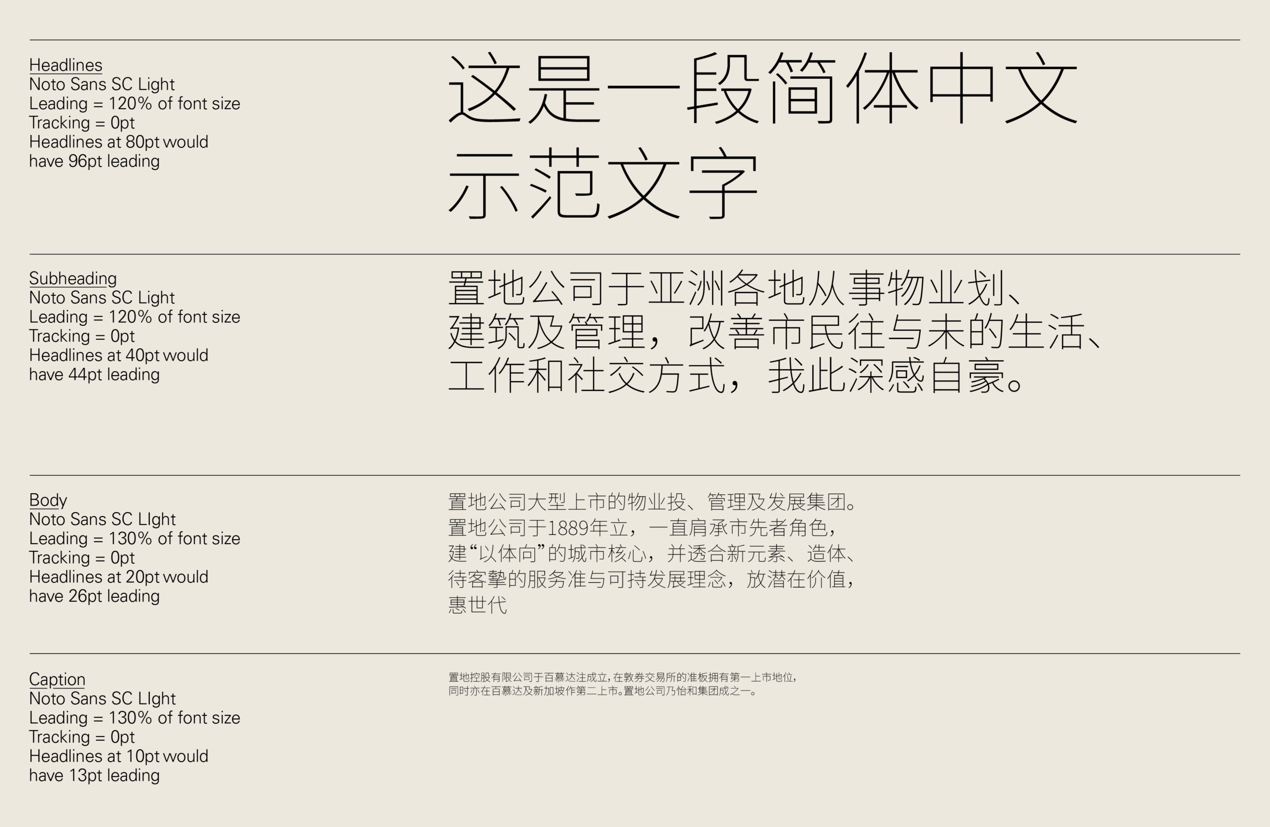
Predominantly the Light weight of the typeface is used for all copy.
The Regular weight is used occasionally for emphasis and adding additional hierarchy.
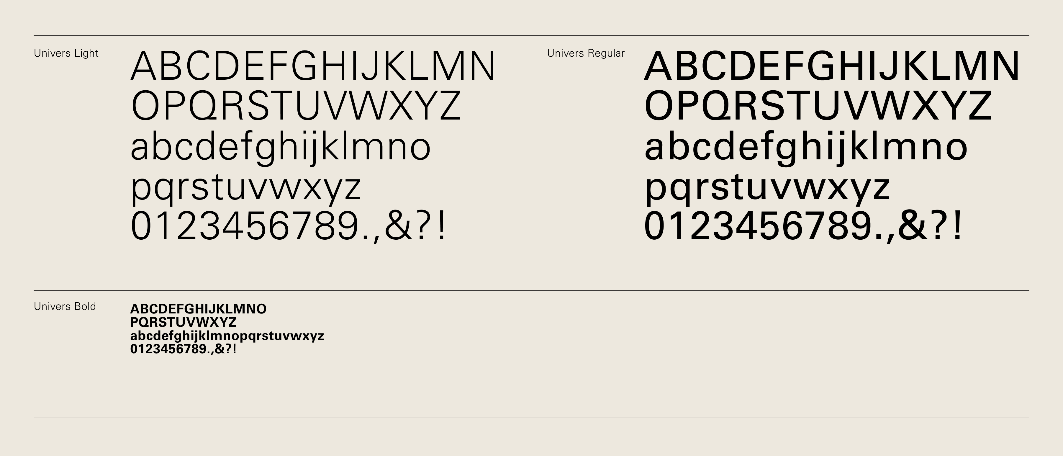

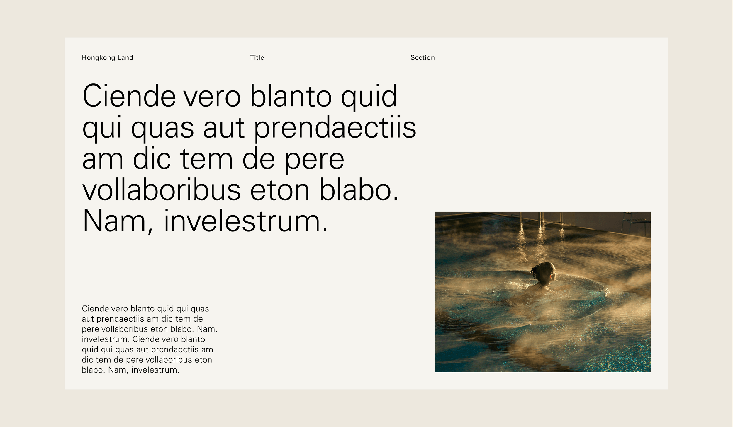
Below are examples of varying font weights within the same size establishing a clear hierarchy.

To use the Chinese company name correctly in text format, Noto Sans JP should be applied to the character ‘置’.


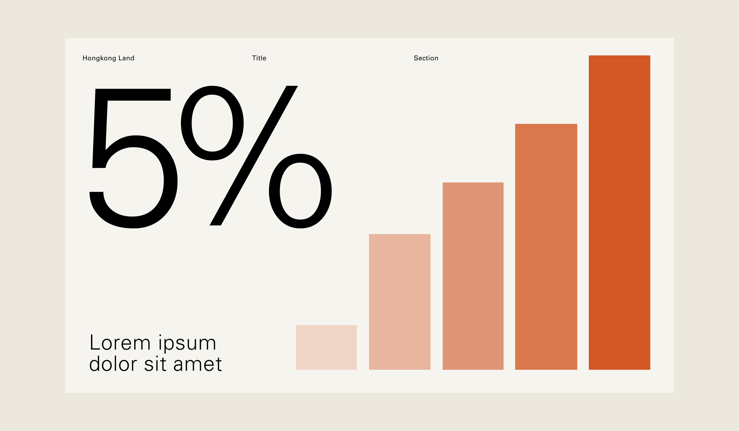
Below are examples of using different font sizes with the same weight which creates a high-contrast hierarchy.
Typography
Styling
The following guides outline how to set type at a number of sizes and how to create a sense of hierarchy.
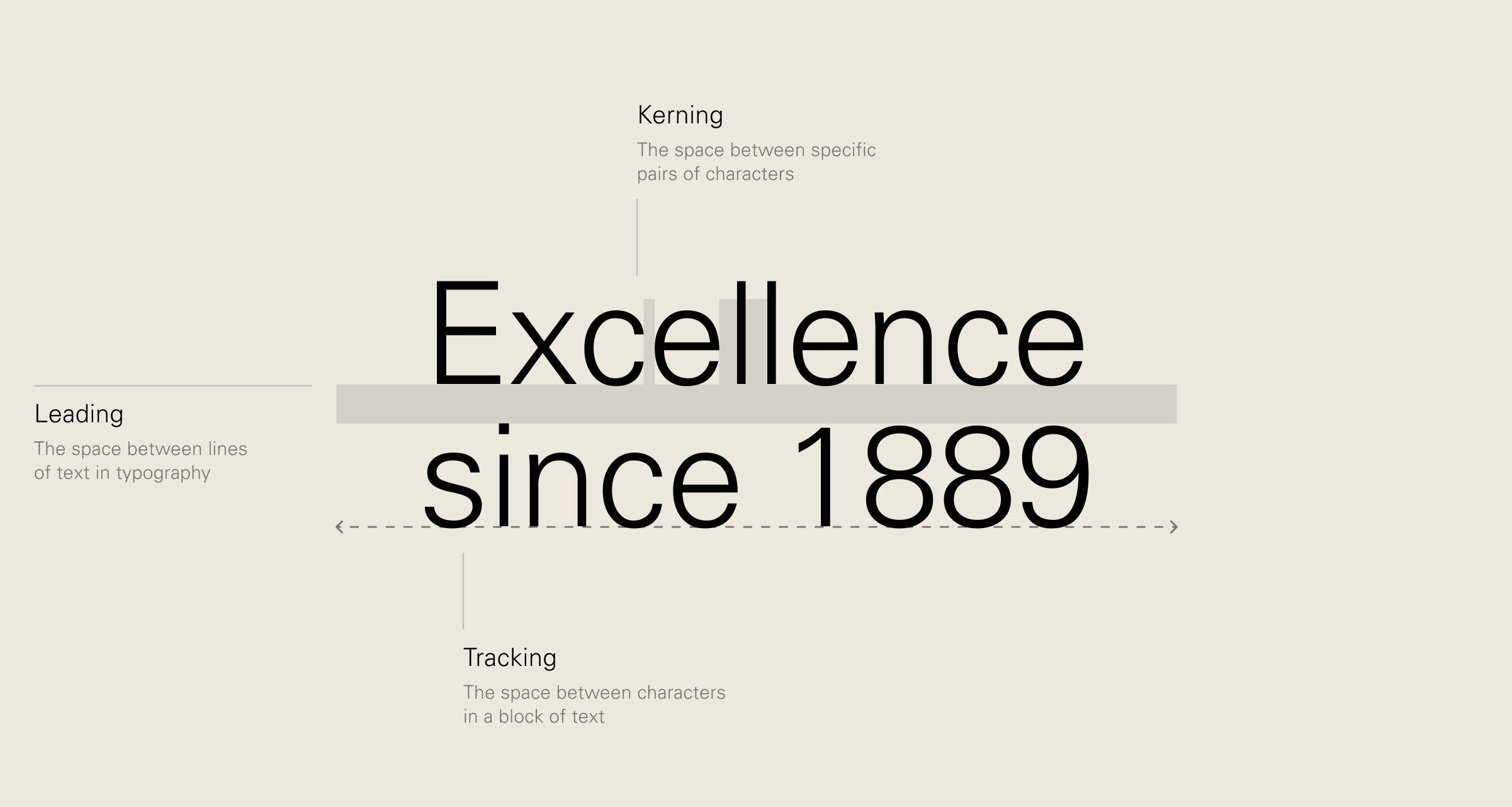
Glossary
Descriptions for some of the techinical terminology used in this section.
English
Traditional Chinese

Simplified Chinese
Typography
Bi-lingual applications
Often two languages will be required to be used at once. The examples below outline two different approaches to create balance on the page.
Single column: Univers + Noto Sans
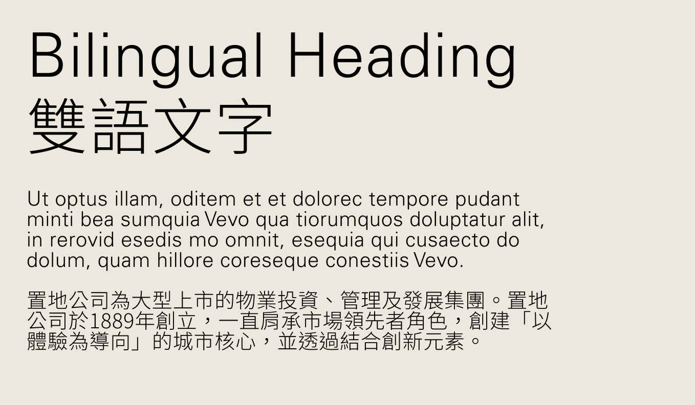
Across two columns: Univers + Noto Sans

If Latin characters appear when using Noto for an alternative language, please keep everything in Noto and do not change the Latin characters to Univers.
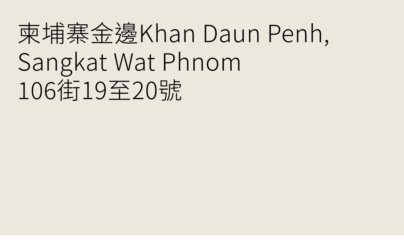
Multiple languages: Noto Sans

Multiple languages: Noto Sans
Typography
Alignment
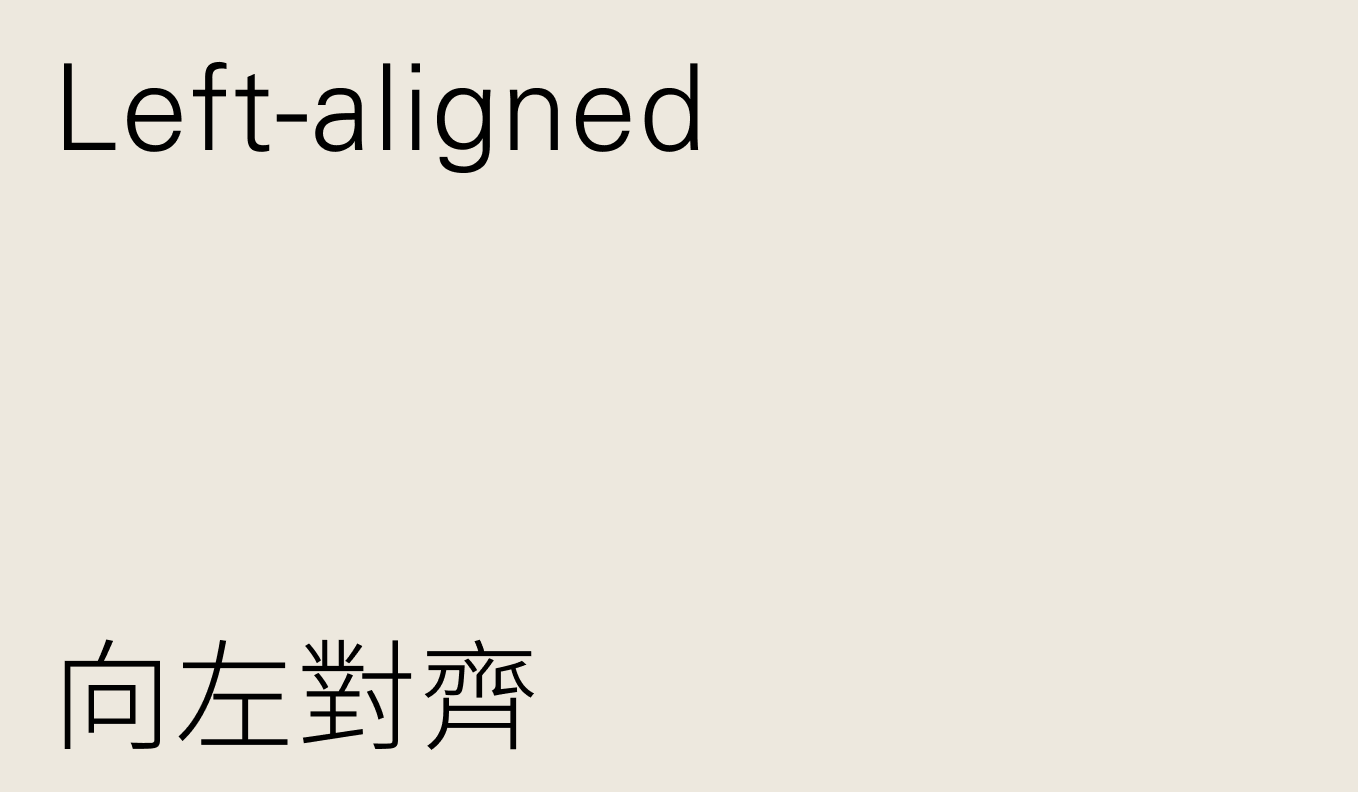
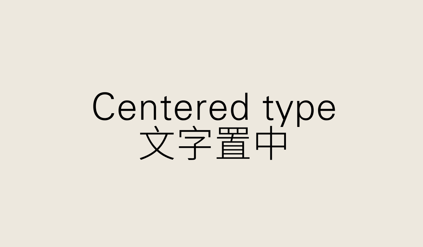
Type is primarily left aligned but can be centred when there is a small amount of copy to lay out or when emphasis is needed for large titles.
Alignment
Headline
Use left-aligned text for headlines.
Centered headings are acceptable for emphasis in headlines
Alignment
Body text
Left-align paragraphs for optimal legibility.

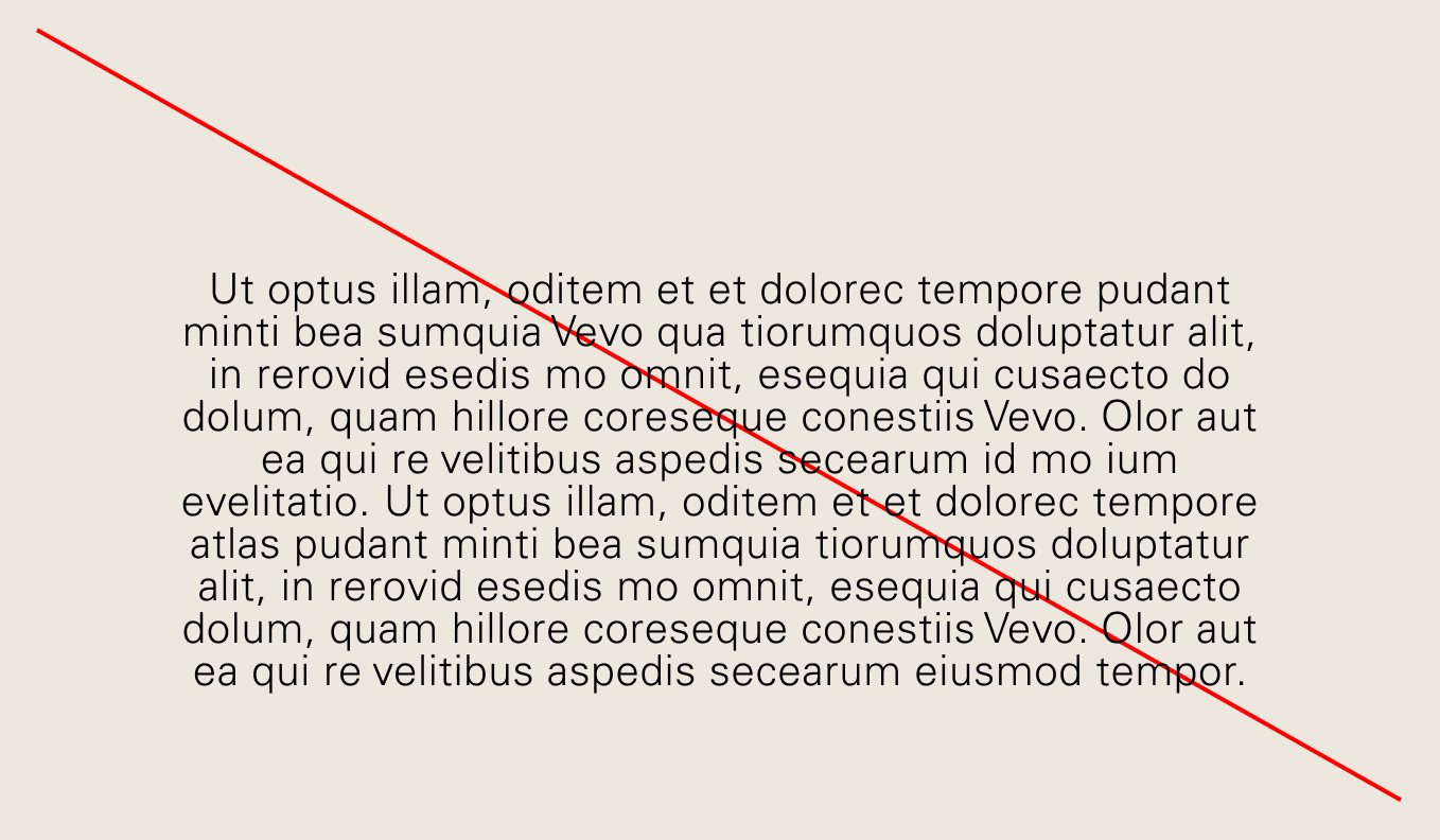
Avoid centered paragraphs to maintain clean, professional layouts.
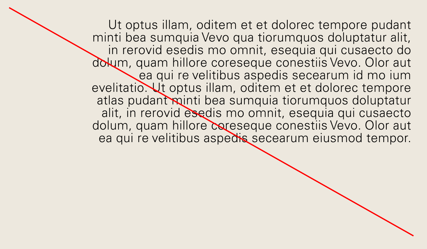
Avoid right-aligning paragraphs to maintain consistent text flow.
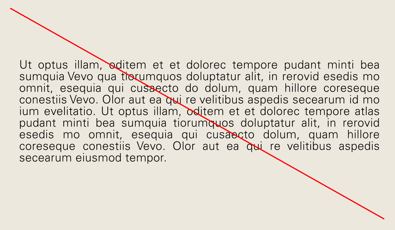
Do not justify text as this leads to uneven word spacing.
Typography
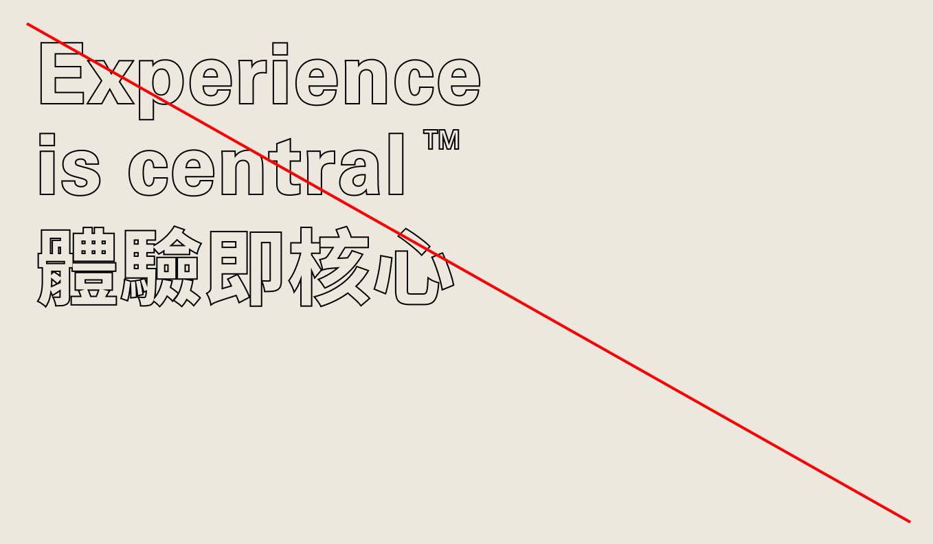
Misuse
To ensure a quality output, please avoid the following.
Don’t use all caps
Don’t apply accent colours to type

Don’t use incorrect leading values
Don’t mix font weights

Don’t distort type

Don’t use incorrect tracking values

Don’t set the leading too loose

Don’t use inconsistent font weights

Don’t use inconsistent spacing

Don’t outline type