Layout
Our layout system creates a premium sensibility through the use of white space and attention to detail.
Layout
Overview
Overview
Grid
Although there is not a single defined grid for the identity, we suggest that the underpinning grid adapts depending on the application. The more content heavy (such as websites), the denser the grid becomes.
4 column
6 column
8 column

Overview
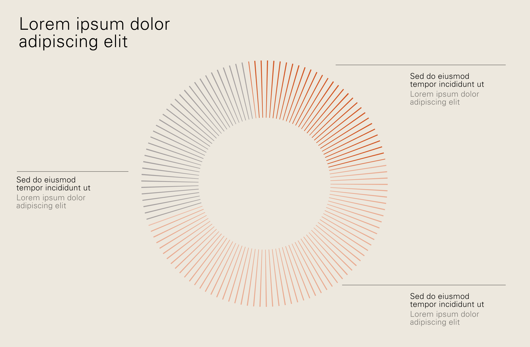
Spacing
Taking an editorial approach, we look to embrace white space and allow room around all elements within a composition.
Overview
Spacing misuse
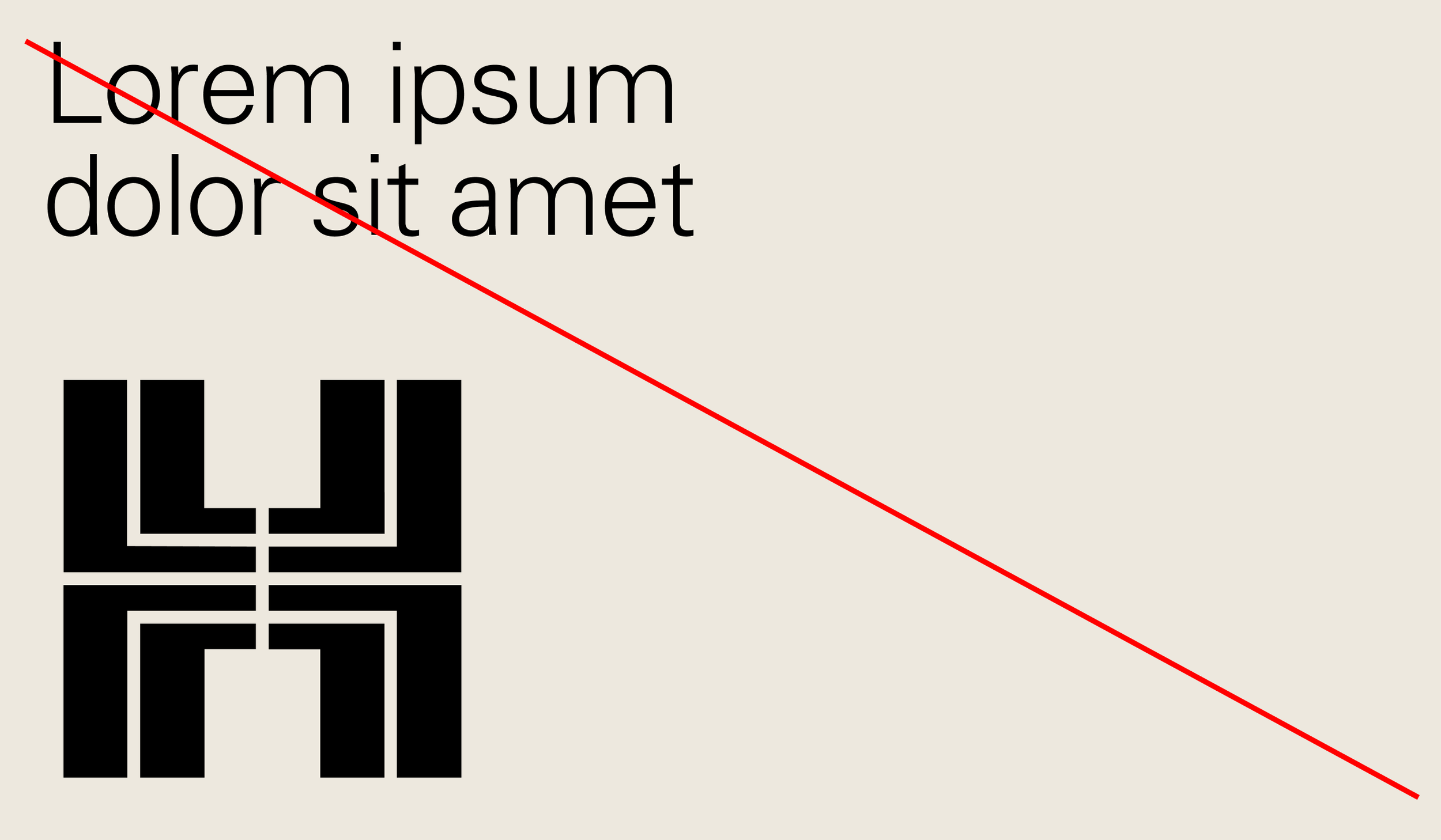
Don’t pair heroric logo with large display typography
Ensure we are creating a clear hierarchy of content in layouts

Don’t set type partially over imagery
Don’t frame imagery within a circle
Don’t crowd layouts
Don’t place content on uneven or disproportional margins
Layout
Construction
Construction
Positioning
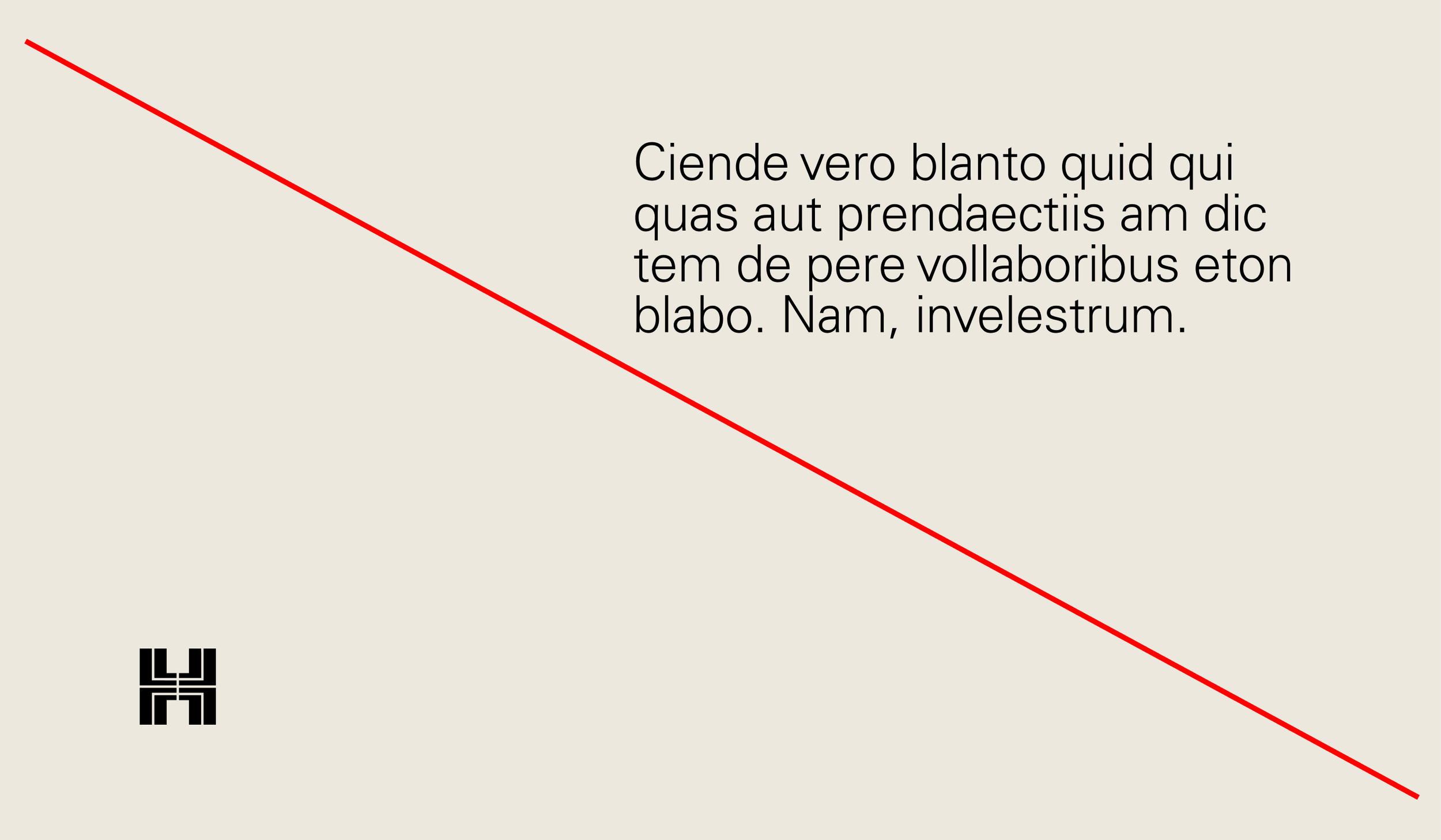
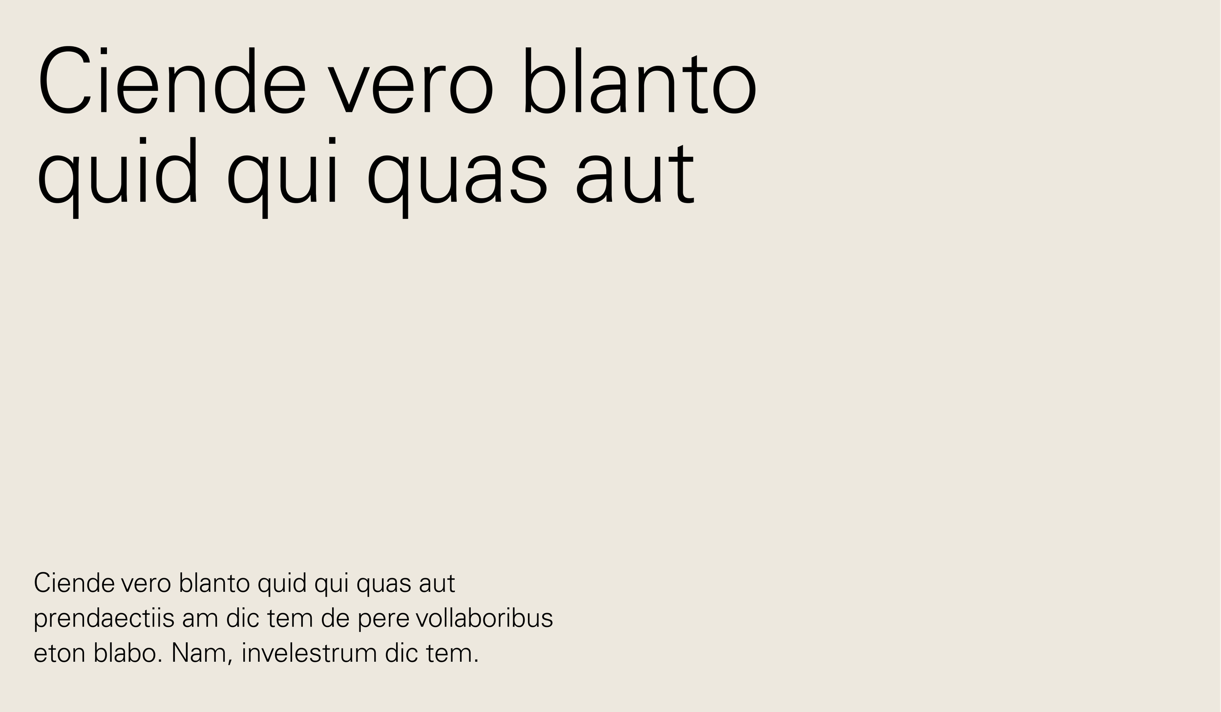
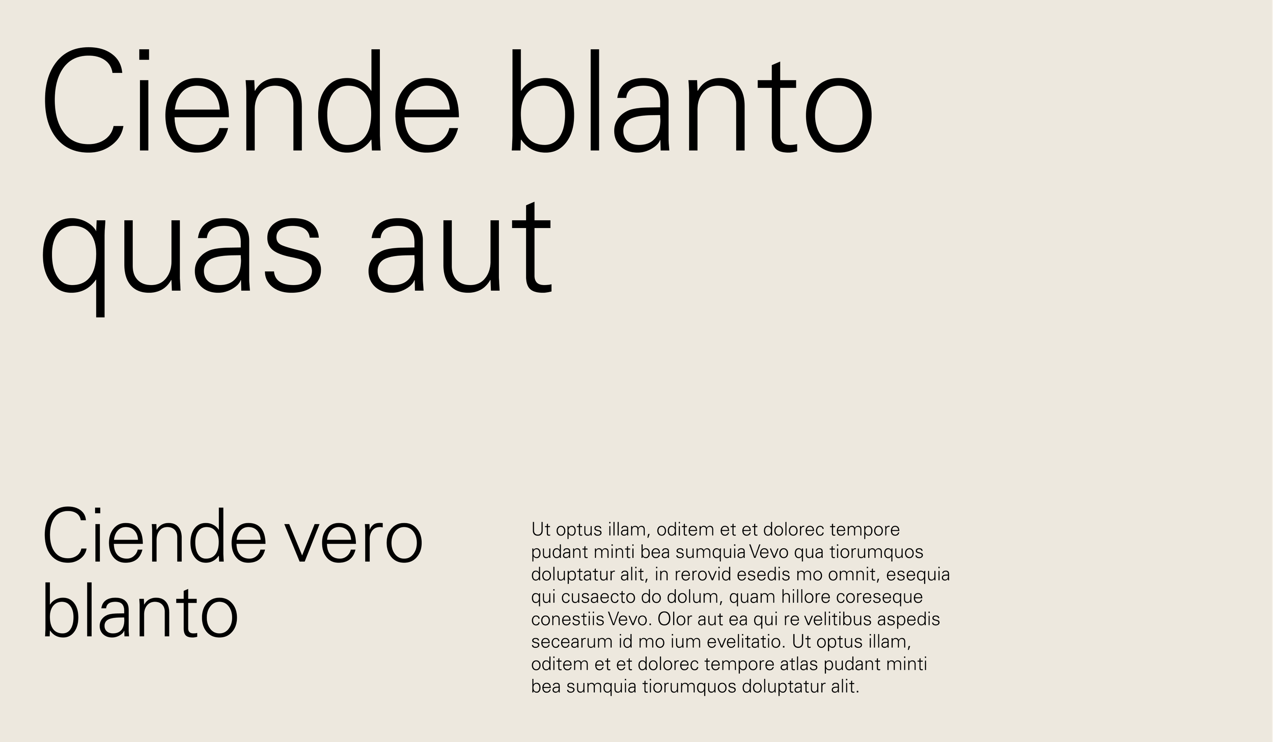
Keep typographic positioning simple, the majority of our compositions begin at a point on the left margin, and form a base from which to build content around.
Construction
Line length
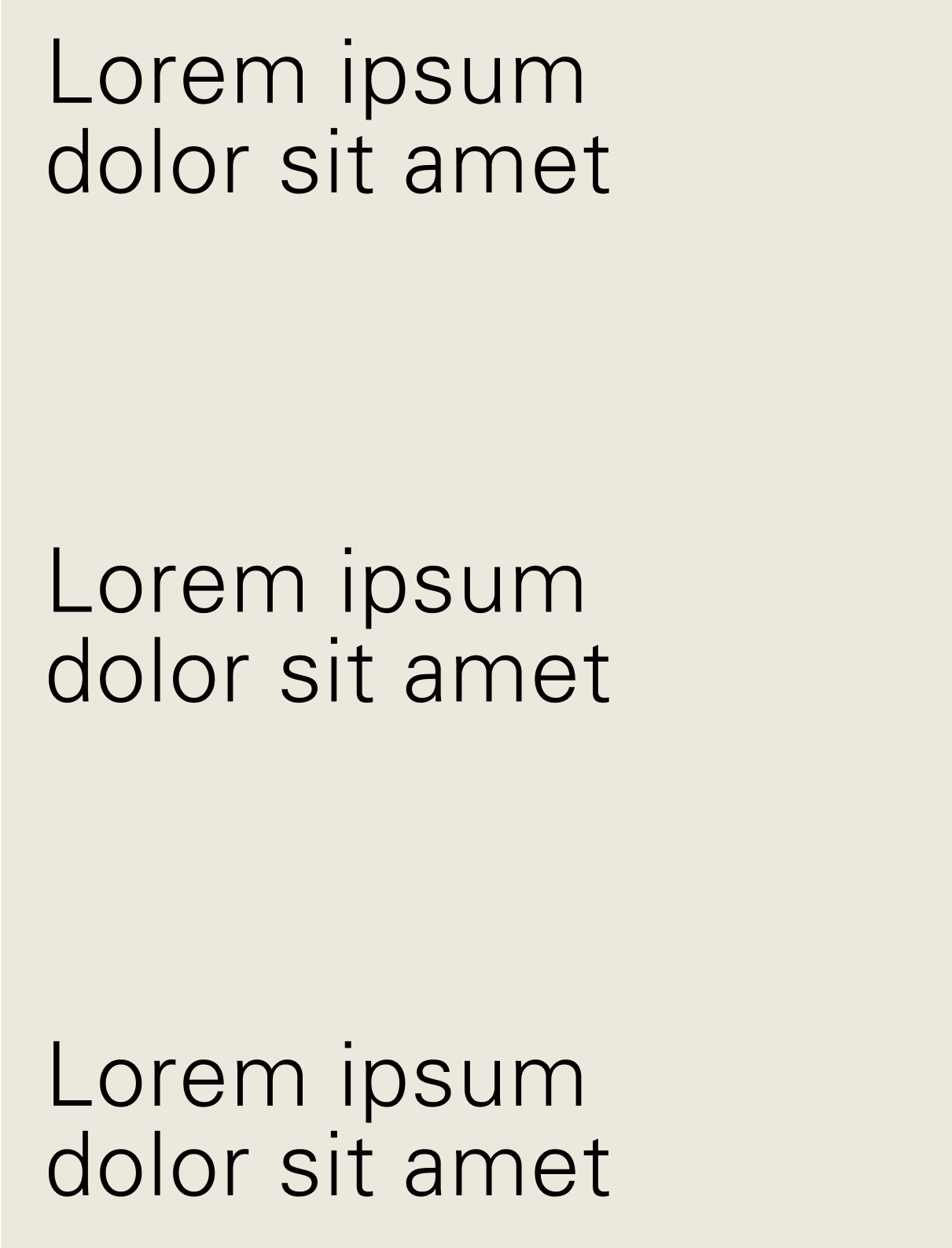
Line lengths refer to the width of a text box and should be addressed on a case-by-case basis. For body copy, the optimal line length is roughly 8–11 words.
Layout
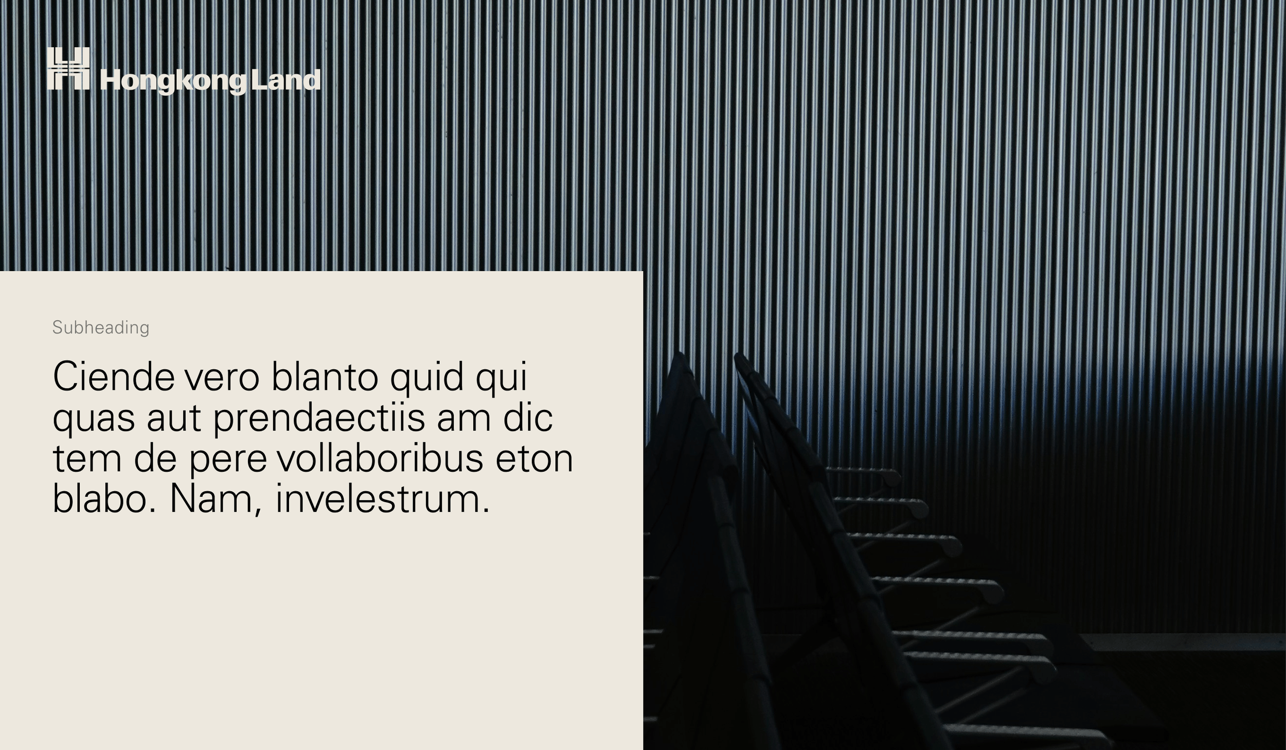
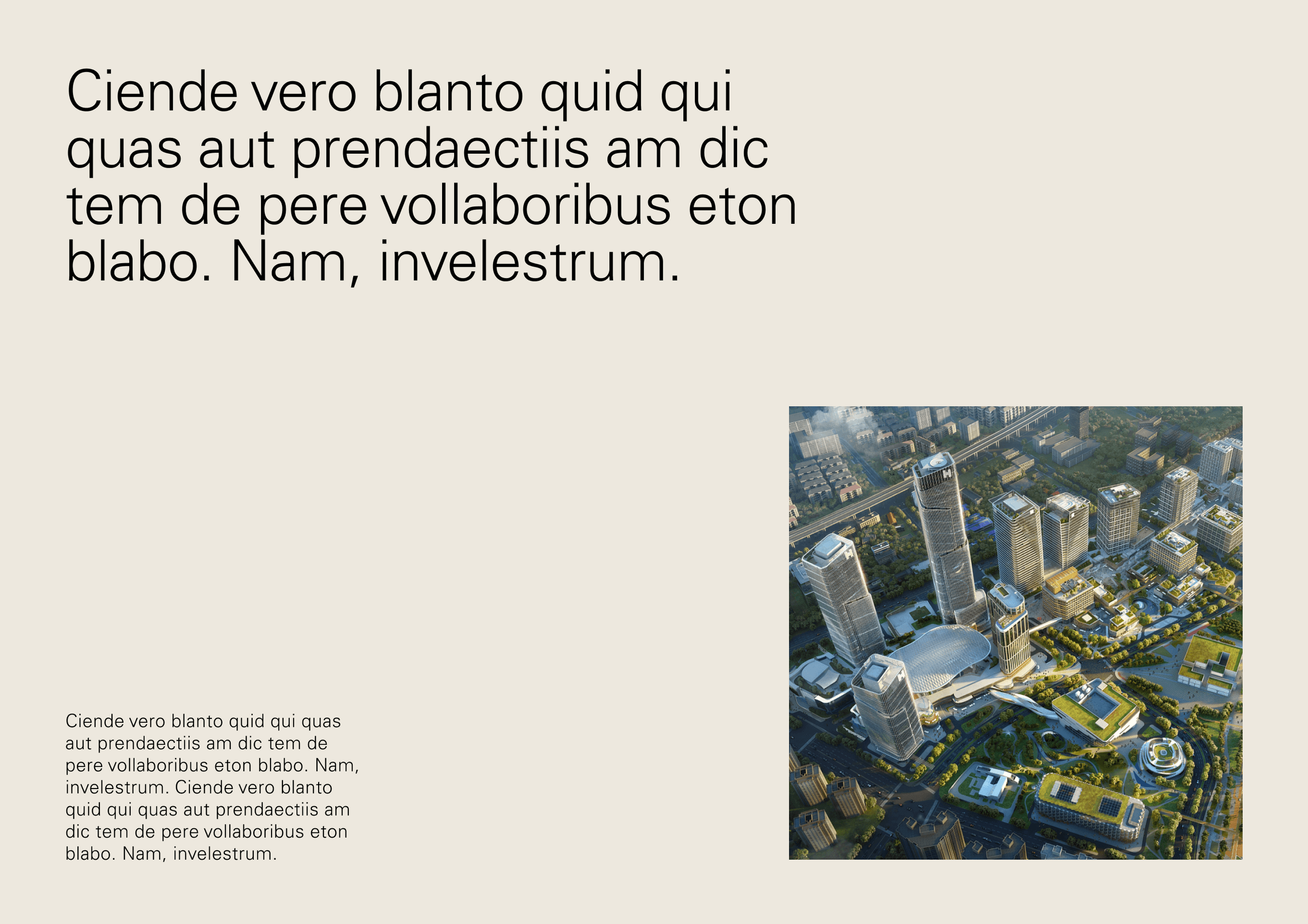
Type and image
Layouts containing type and image should be kept simple. We must ensure that we don’t crowd a composition and that image and typography are legible.
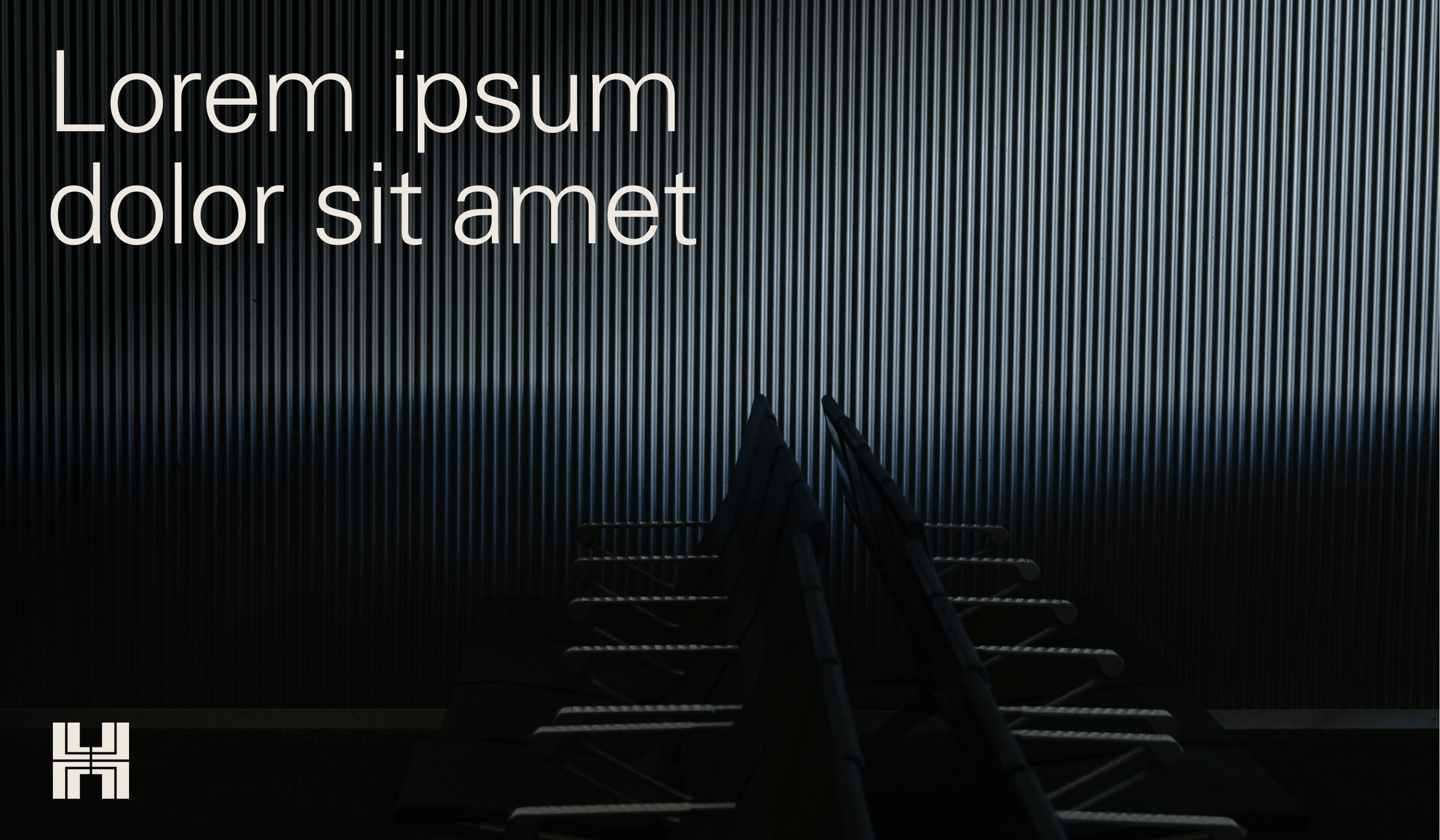
Type on image
50:50 type & image

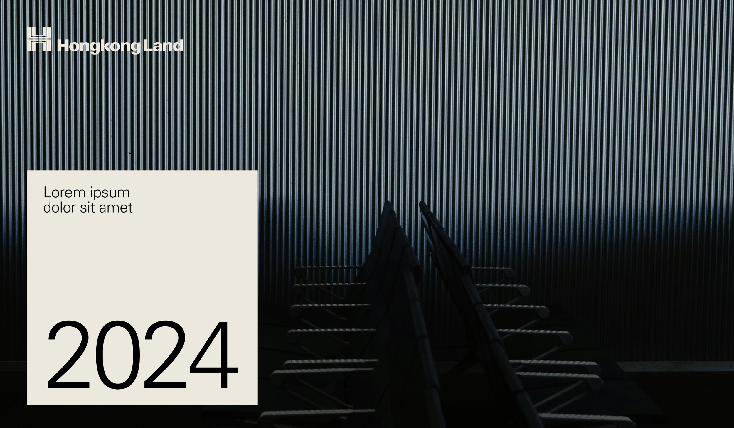
Corner text box (long-form)
Text box overlay (display)
Layout
Image framing
There are three ways imagery can be framed throughout the identity.
Full bleed

In rectangular boxes
In angled frames

Layout
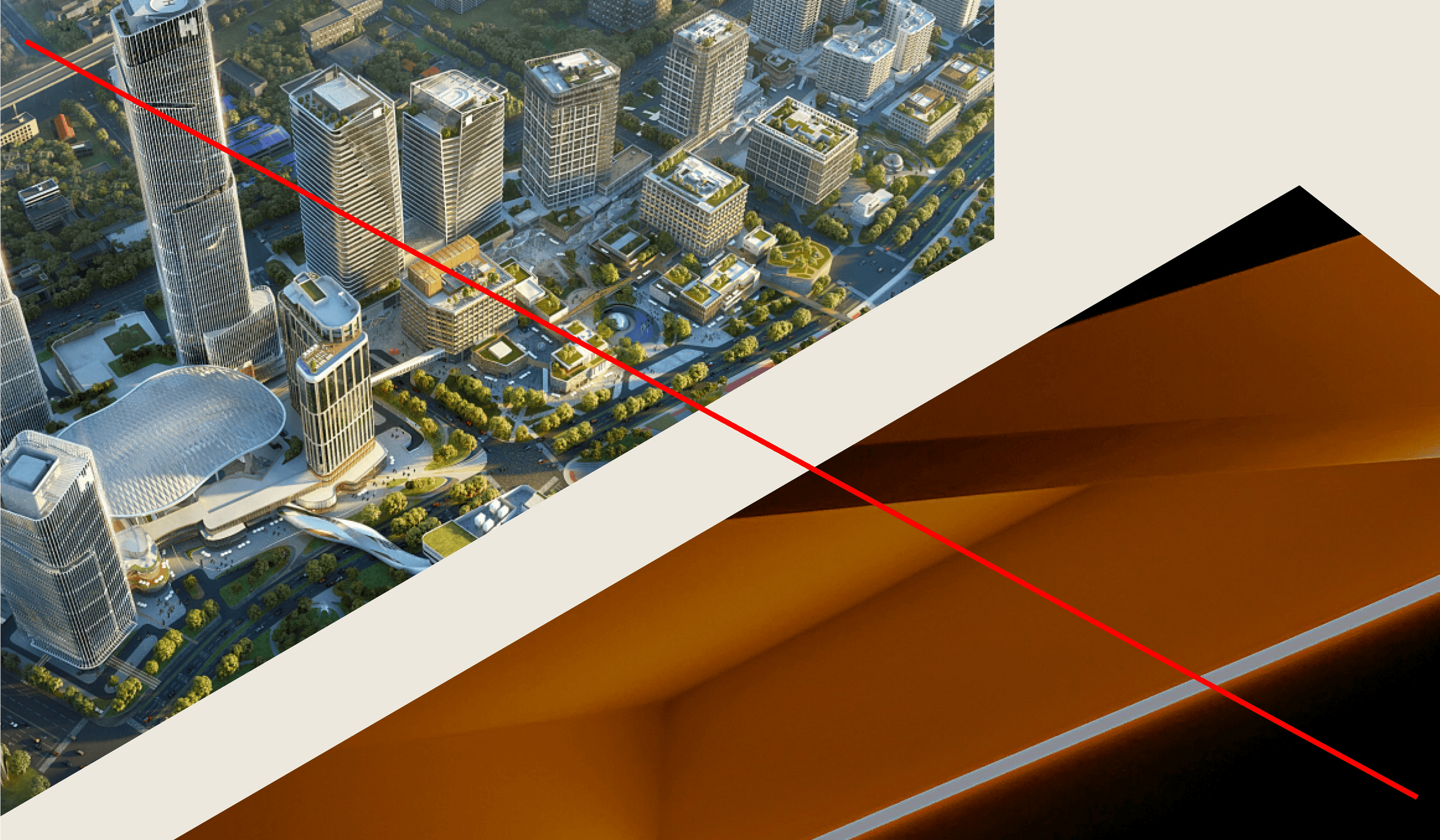
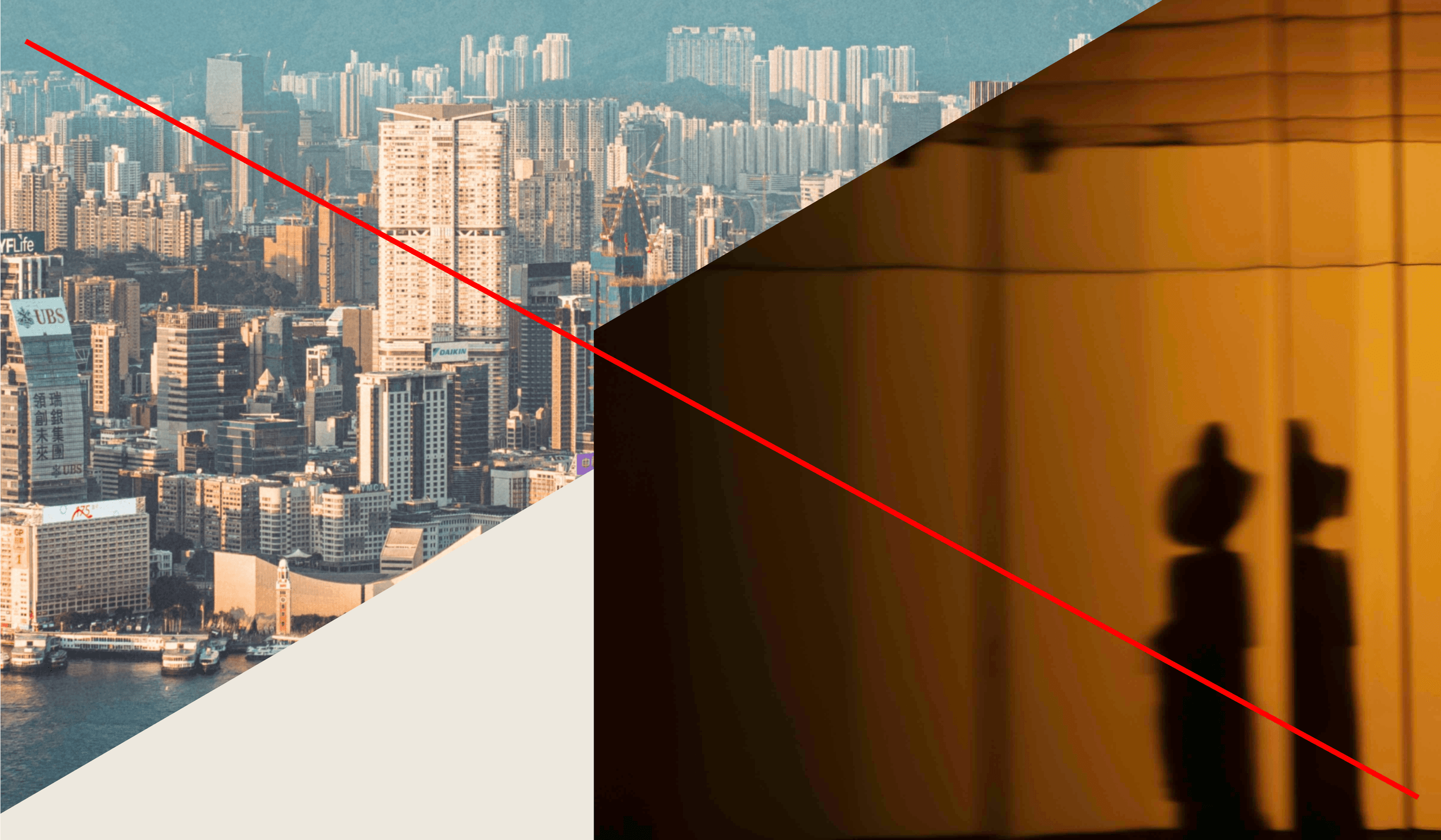
Angular image framing
Derived from the 30° angles within our patterns, imagery can be placed within unique angular shapes. This device is useful for displaying multiple images within a layout, but should be used sparingly. The primary way to use imagery will always be in rectangular frames.

Image frame should be cropped at a 30° angle
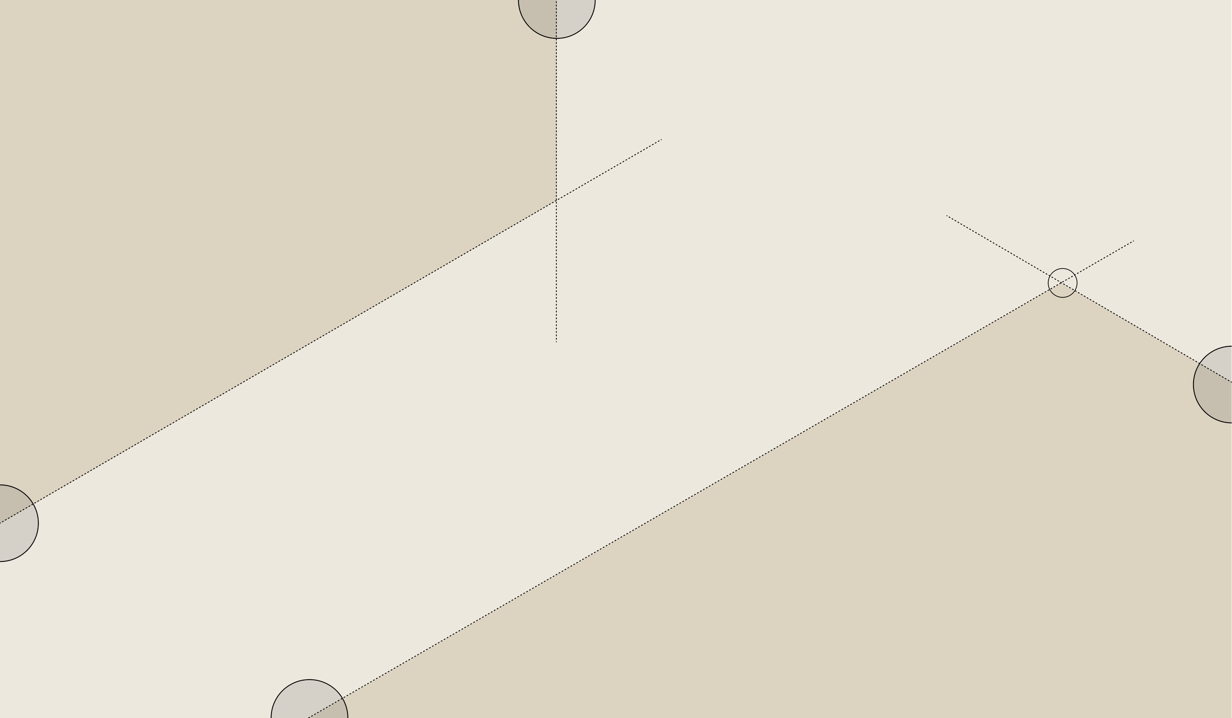
Two sides of each shape must bleed off the edges of the layout, so only one corner should be seen. The angle of this corner should always be 120°. It is created by joining the angled line with a vertical or a line at 30° in the opposite direction.
Angular image framing
Examples
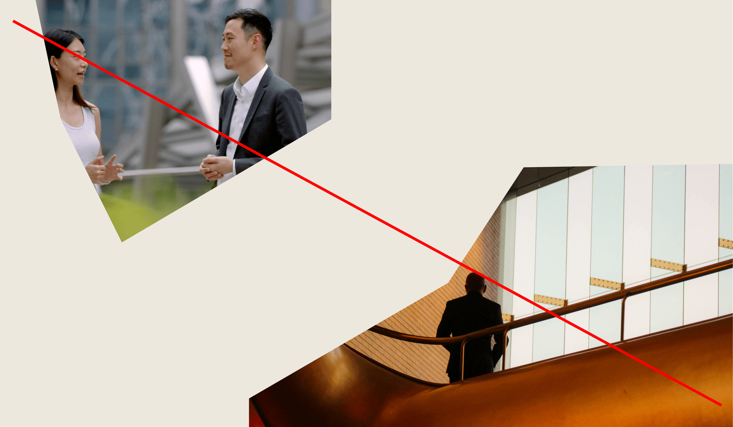
Single images within shapes

Two images within shapes

Angular image framing
Misuse
Don’t use frames consisting of more than one corner
Don’t use frames that aren’t a 30° angle

Ensure there is space around image frames
Don’t overlap two image frames
Layout
Micro detailing
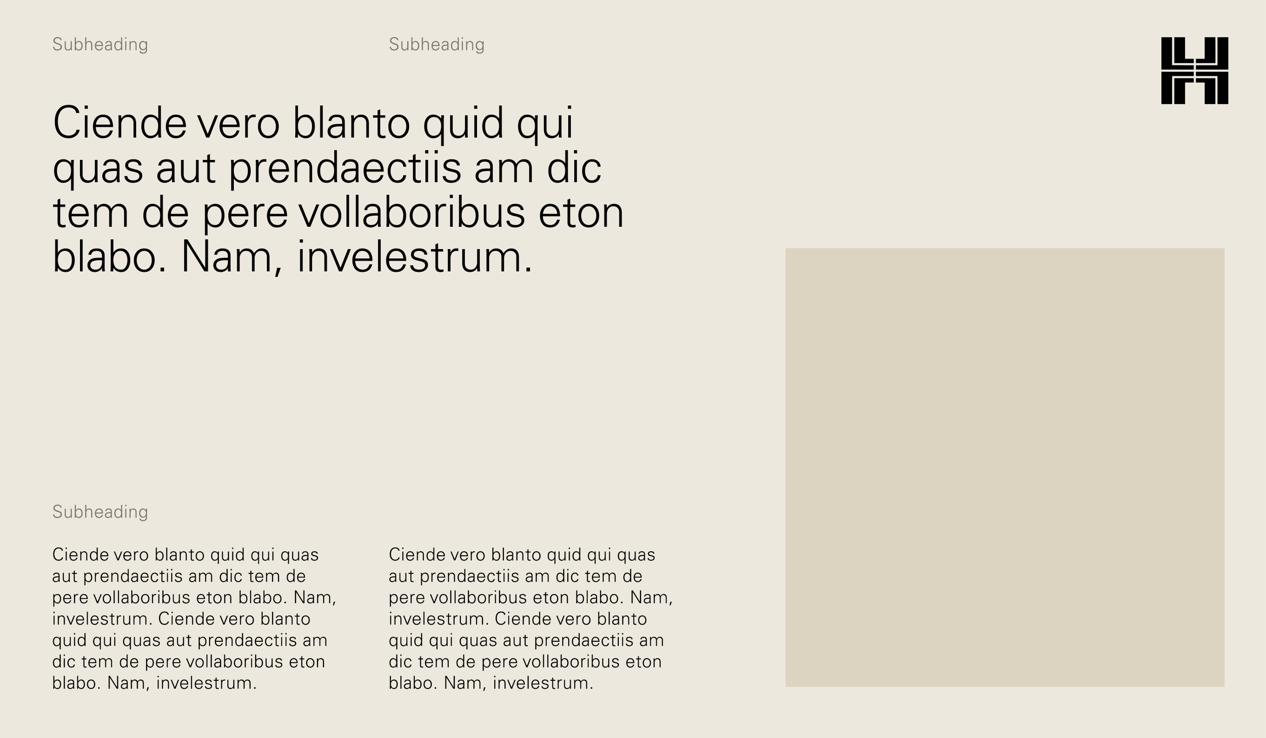
To ensure a sophisticated look, attention to detail when setting type is vital. The examples below outline some of the finer details in our system.
High contrast in size between headings and subheadings

High contrast in size between headings and subheadings
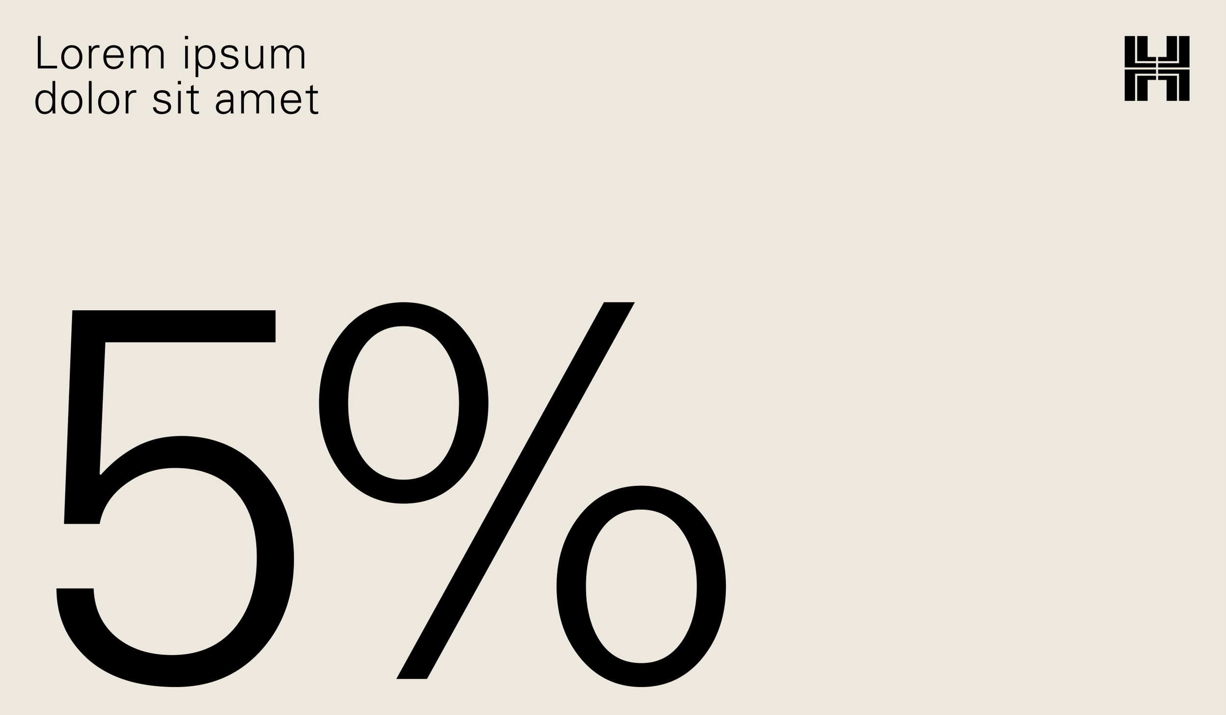
High contrast between text and numbers
High contrast between text and numbers
Using tinted text to create hierarchy

Using tinted text to create hierarchy