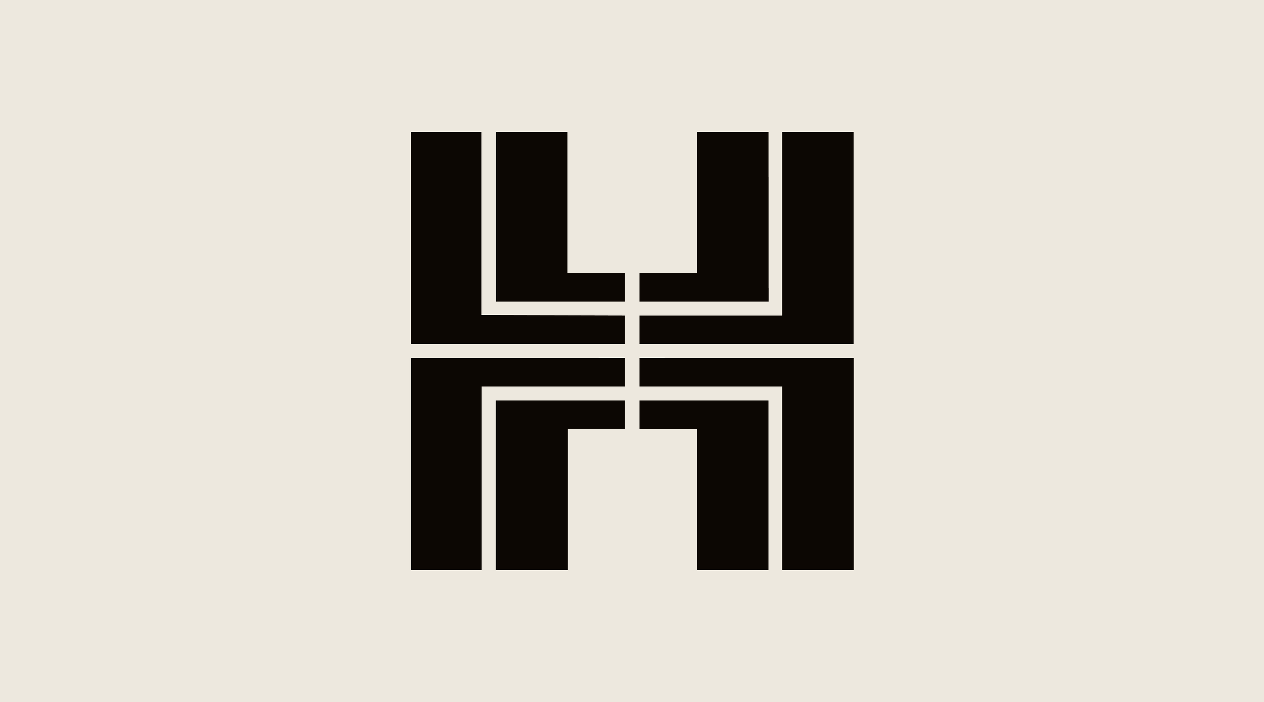
Symbol
Originally created by legendary designer Henry Steiner, our symbol has been in use for over 50 years. The now iconic H symbol took it’s inspiration from the floor plans of buildings, the walkways between them and the ancient Chinese character for longevity.
Consistent use of clearspace, thoughtful color application, and precise execution ensure the symbol remains iconic across all contexts, preserving its prestige and bringing its original lustre to every touchpoint.
Symbol
Animation
Our animated symbol evolves for the digital world, bringing dynamic and expressive movement to our identity.
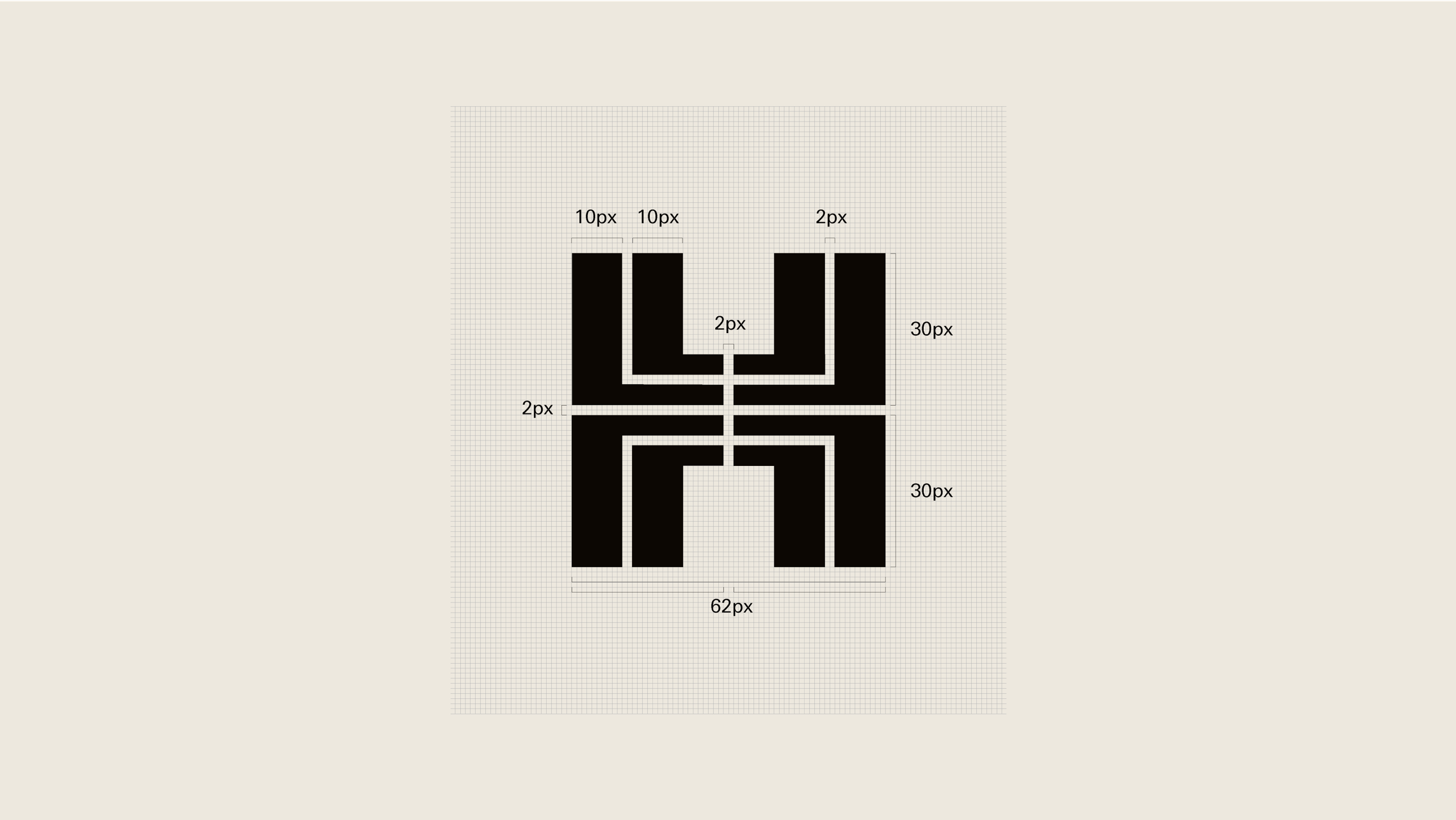
Symbol
Construction
Our symbol has been redrawn for the digital age, with a pixel structure in mind. It’s area is now a perfect square.
Symbol
Usage
Our symbol is a dynamic visual element that allows us to represent the brand without the need for the full logo, giving us the flexibility to create a wide range of visual materials whilst maintaining brand recognition.
If the symbol is used alone, the company name should be present somewhere on or next to the application.

Positioning
Heroic moment
In a heroic capacity, the symbol should be positioned prominantly in the centre of the composition.
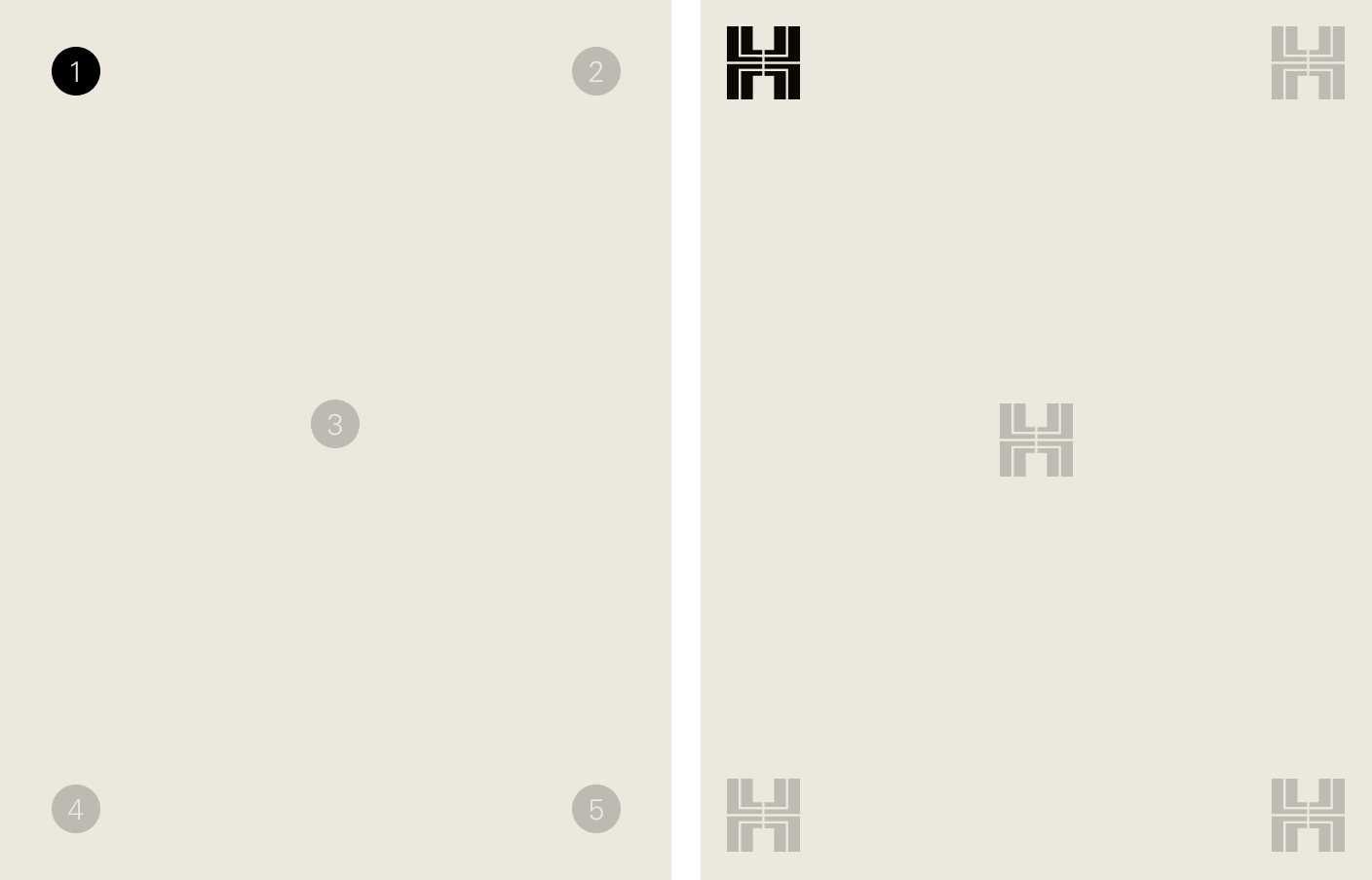
Positioning
Supportive placement
In instances where the symbol is being applied in a more supportive capacity, it should be positioned in the corners of a layout and align with the margins.
Symbol
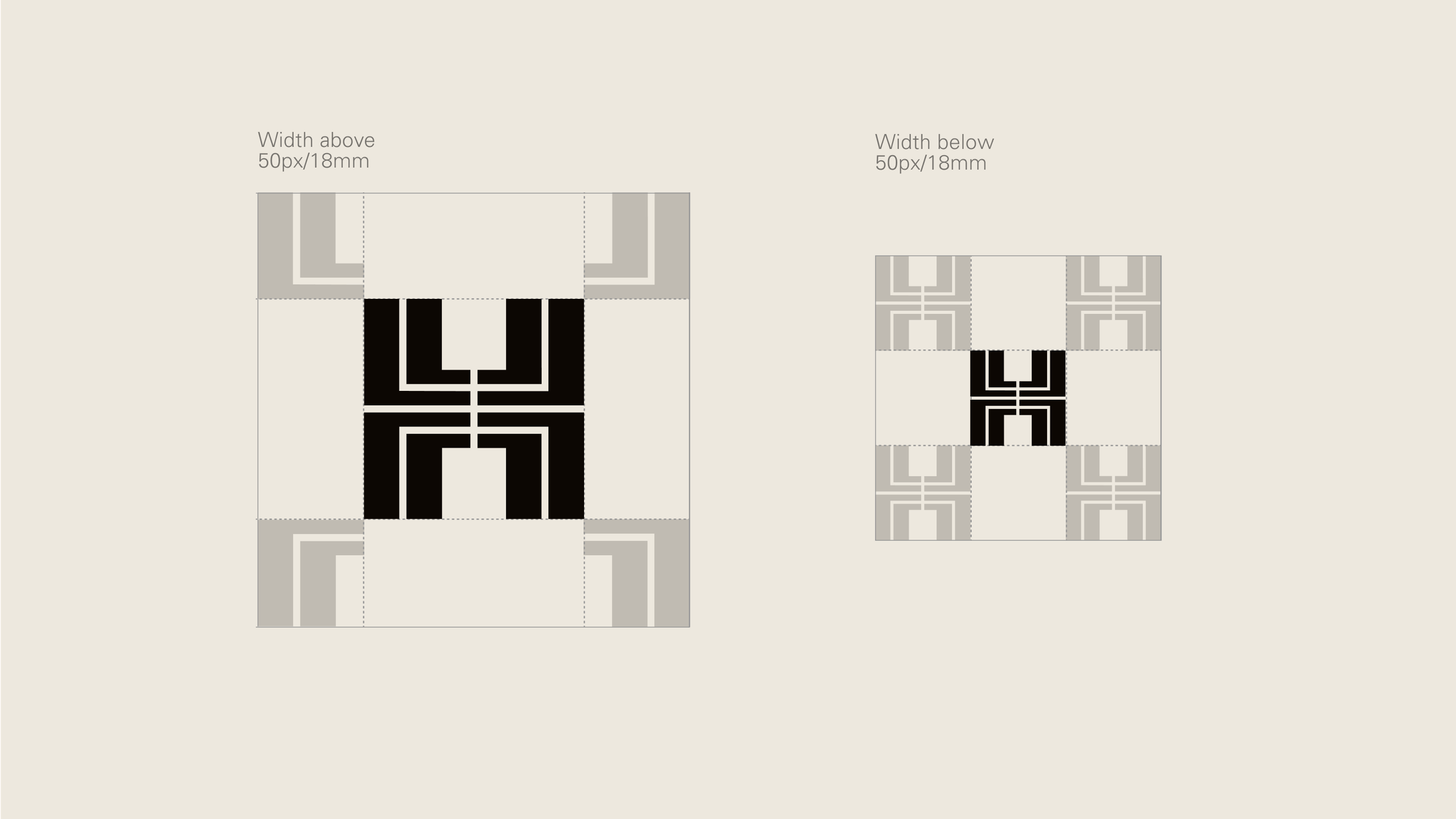
Clearspace
Our symbol requires a clearspace defined by the size of the symbol. This ensures sufficient distance from any margins and surrounding elements, maintaining the symbol’s’s prominence and visual integrity.
Symbol
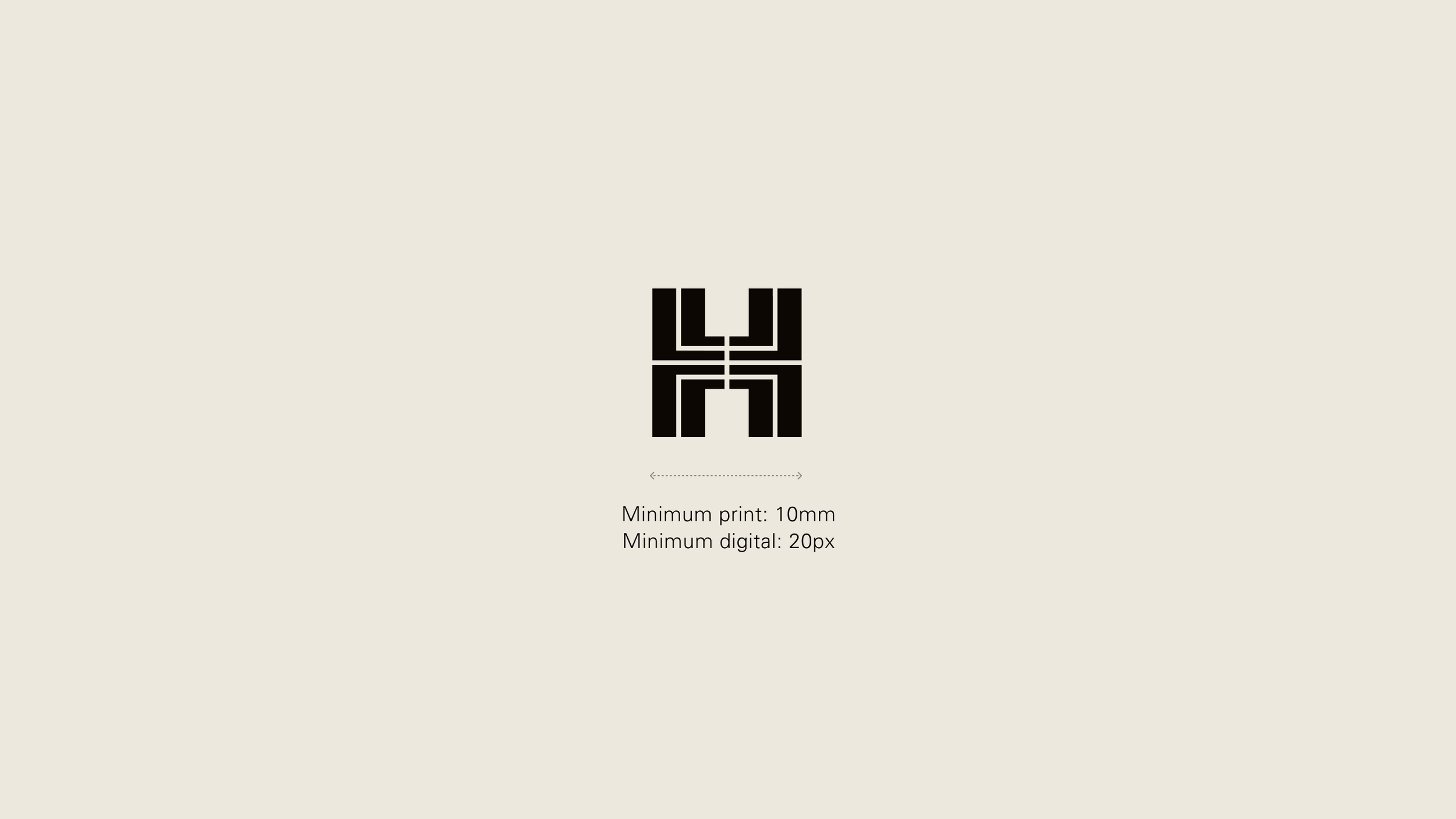
Scaling — Minimum size
Our symbol has been carefully crafted to maintain legibility, even at small sizes.
Our recommended minimum size (width) is 20 pixels for screen, and 10 mm in print.
Symbol
Colour
Our symbol should only be used in colours from our neutral palette. It should predominantly be used in either Black or White.
When placed over imagery, choose a colour which will ensure sufficient contrast between the background and the symbol.
Neutral backgrounds

Black on accent

White on accent

White on image
Symbol
Icons
The symbol should be used for all social icons and favicons.
Icons
Construction


Symbol
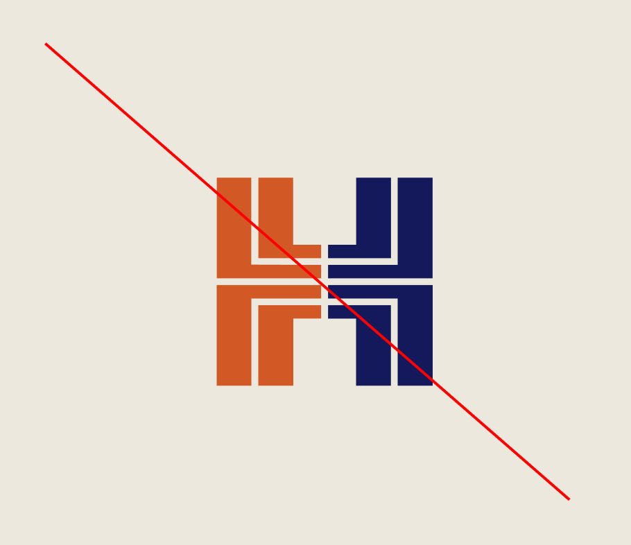
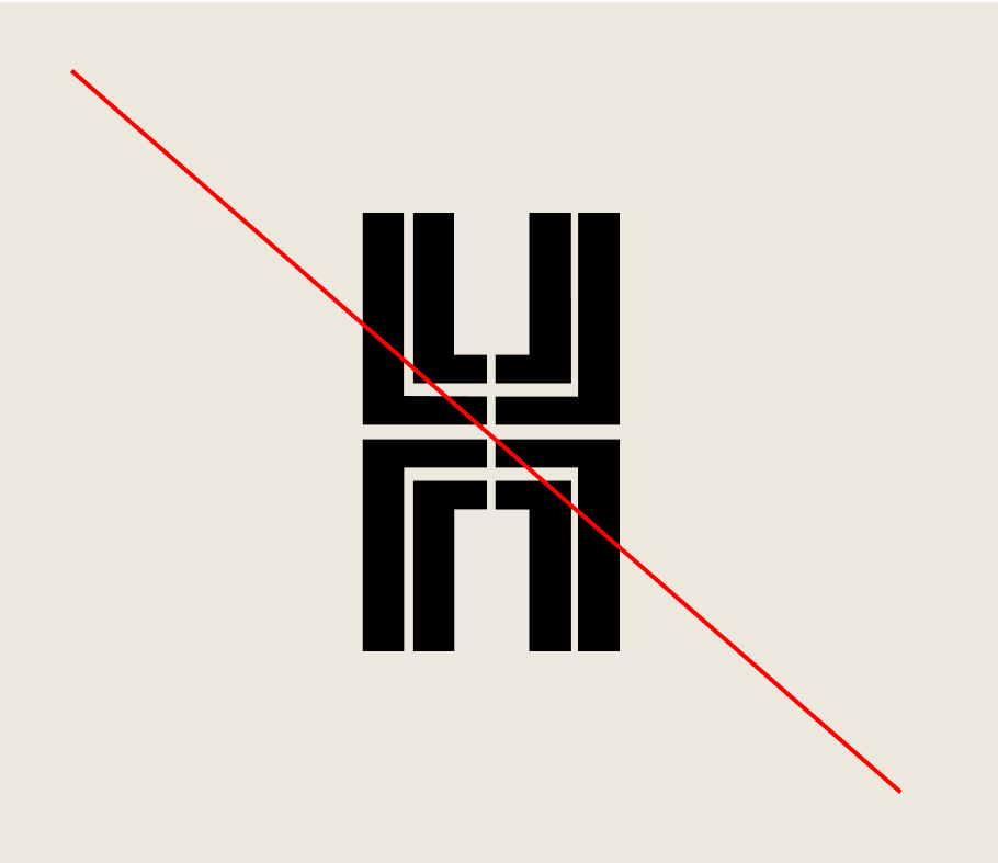
Misuse
To maintain consistency, the symbol must not be altered, modified, or embellished in any way. Avoid any reinterpretation or distortion to preserve its integrity.

Do not rotate the symbol
Do not apply multiple colours to the symbol
Do not distort or warp the symbol in any way
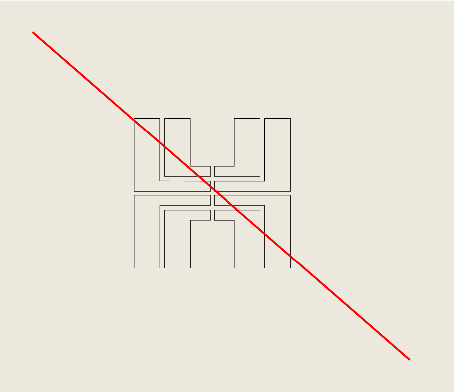
Do not outline or create a keyline around the symbol
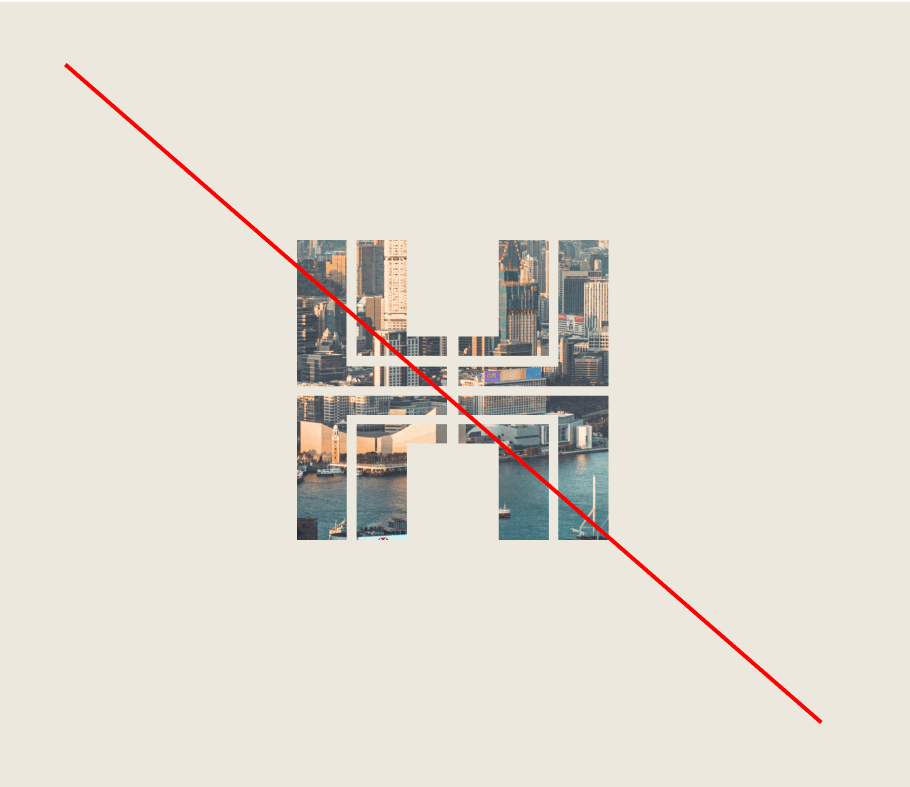
Do not use the symbol as a framing device for imagery

Do not rotate the symbol