Colour
Our colour palette embodies simplicity and elegance, with neutral tones forming its foundation. Additional bolder tones can be utilised as accent colours throughout the identity.

Colour
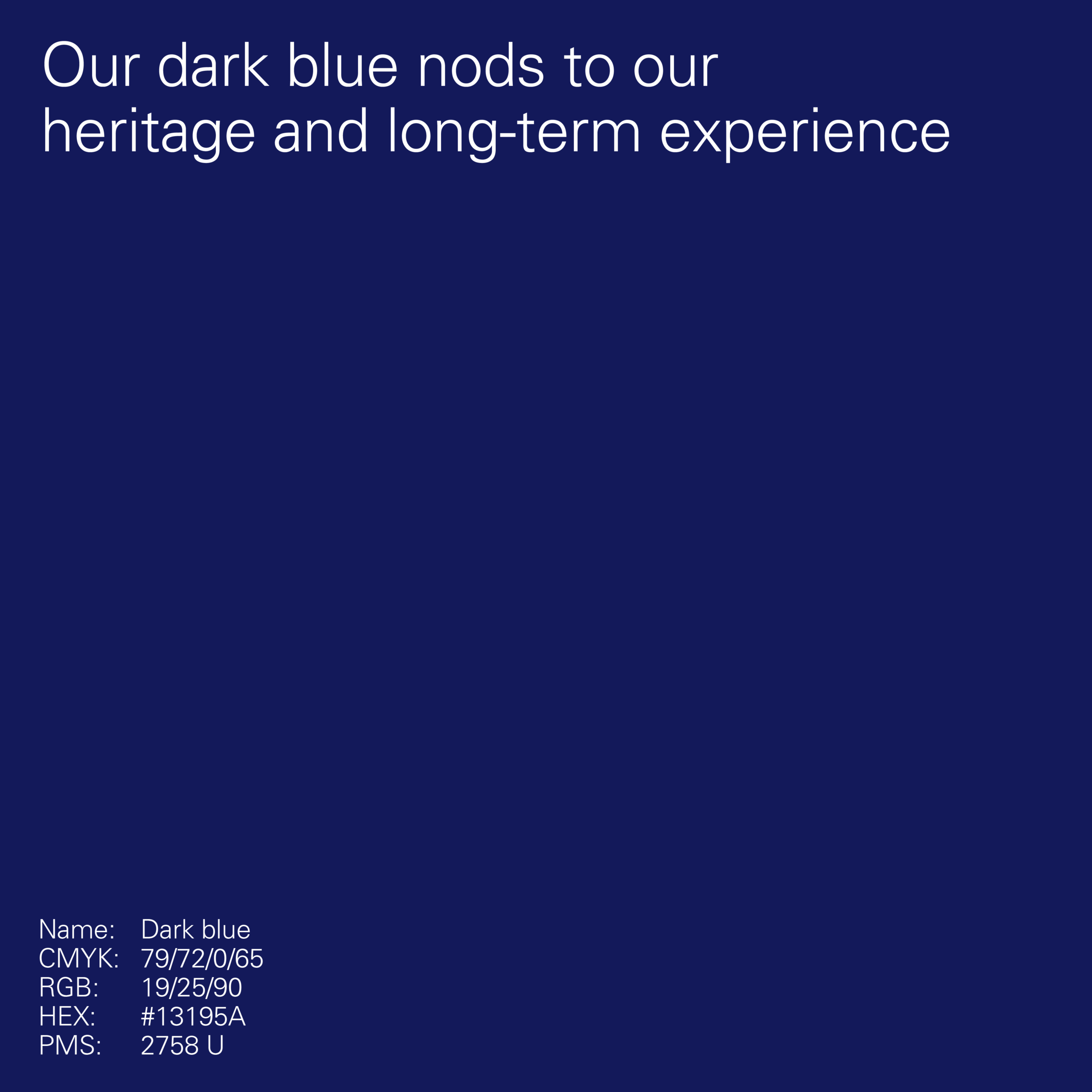
Primary neutral colours
The foundation of our colour palette is formed by a collection of neutral tones. They ensure the identity feels premium and sophisticated, whilst also ensuring legibility across applications.


Colour
Primary accent palette
Our primary accent colours are the default colours to be used beyond our neutral tones in applications. There’s no requirement to use a specific blue for a particular type of application and this should be addressed on a case-by-case basis.


Colour
Secondary accent palette
Our secondary palette unlocks a selection of accent colours which can be used instead of blue. They are bright, dynamic tones that pair well with our neutral colours.
Only one accent colour should be used in a layout, unless being used to colour code information.


Colour
Usage
Different colour combinations can be used to change the tone of an application, therefore the colour palette chosen will depend on the messaging and content in the application.


Colour
Pairing
It is essential that colour pairings are kept consistent and maximuse legibility.
Black sits over light colours


White sits over dark colours


Patterns can be matched to the text colour


For more focus on messaging, patterns can have less contrast with the background


Black sits over solid patterns with accent colour


Pairing
Misuse

Don’t pair two accent colours

Don’t set an accent colour over black

Don’t pair accents with non-contrasting neutrals

Don’t set an accent over a neutral
Colour
Misuse
Examples of colour pairings to avoid.
Don’t use multiple accent colours within a single composition
Don’t apply accent colours to typography or logos

Don’t set one accent colour over another

Don’t apply accent colours over imagery

Colour
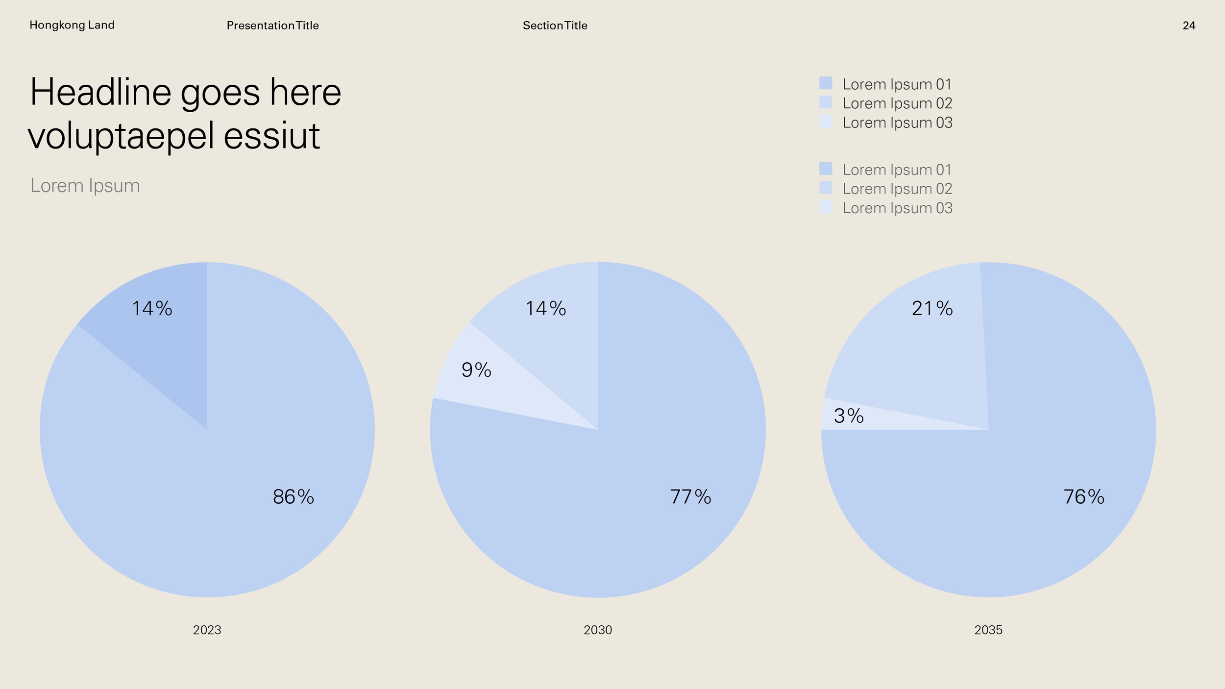
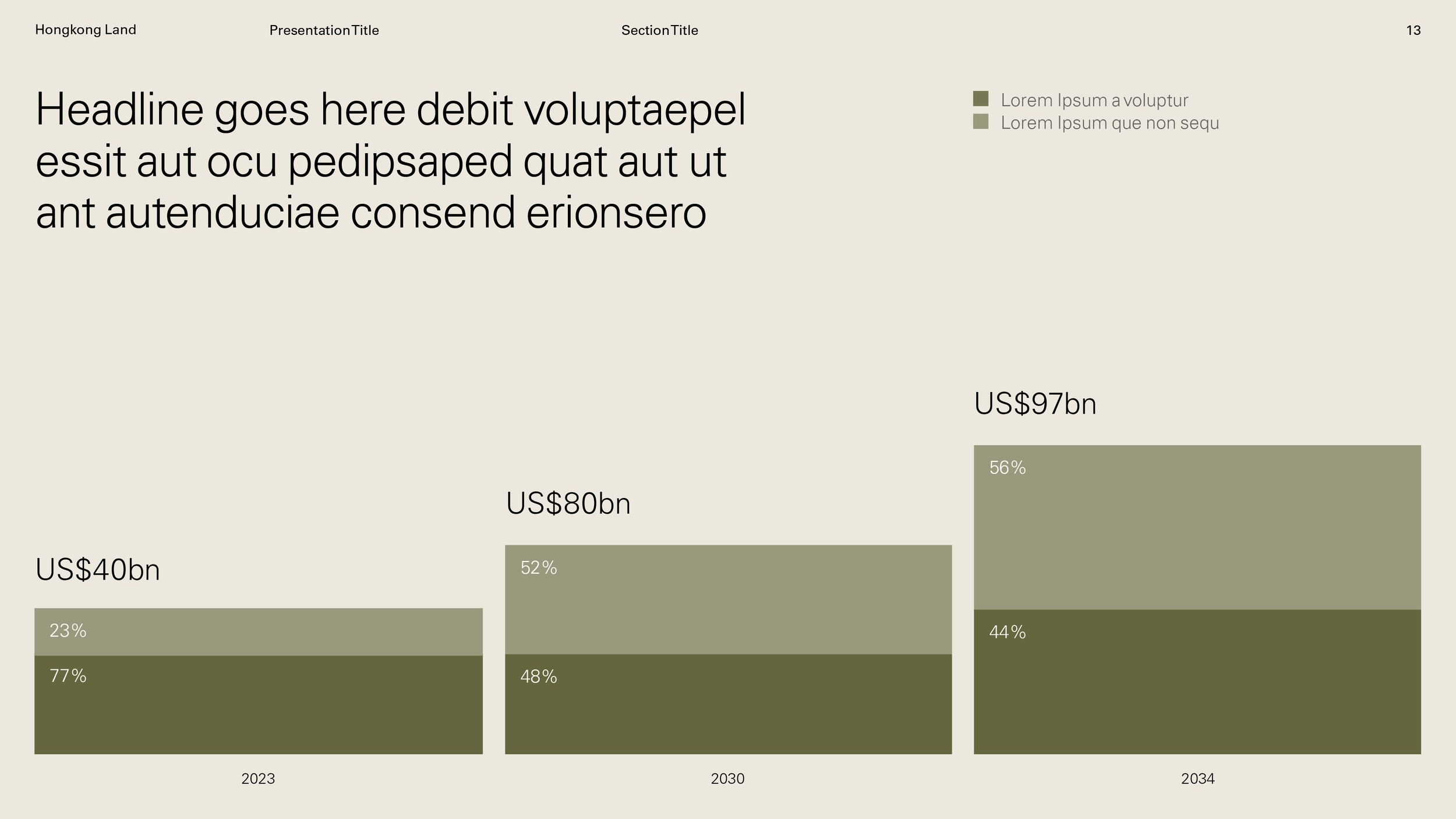
Tints
A combination of tints can be useful when communicating complex data. Always ensure good contrast between the colours used and aim to use tints from no more than two core colours at once.

Colour — Tints
Usage
The primary use of tints will be for handling multiple data sets within singular applications, such as infographics