Logo
A symbol of trust and excellence for over 50 years, our logo stands as a timeless representation of our legacy.
Consistent use of clearspace, thoughtful colour application, and precise execution ensure the logo remains recognisable across all contexts, preserving its prestige and bringing its original lustre to every touchpoint.
Logo
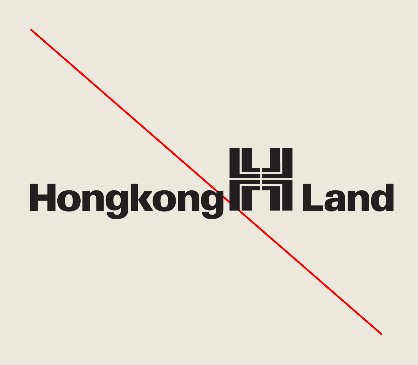
Our logo
Inspired by the ancient Chinese character for longevity, our logo embodies enduring strength and heritage.
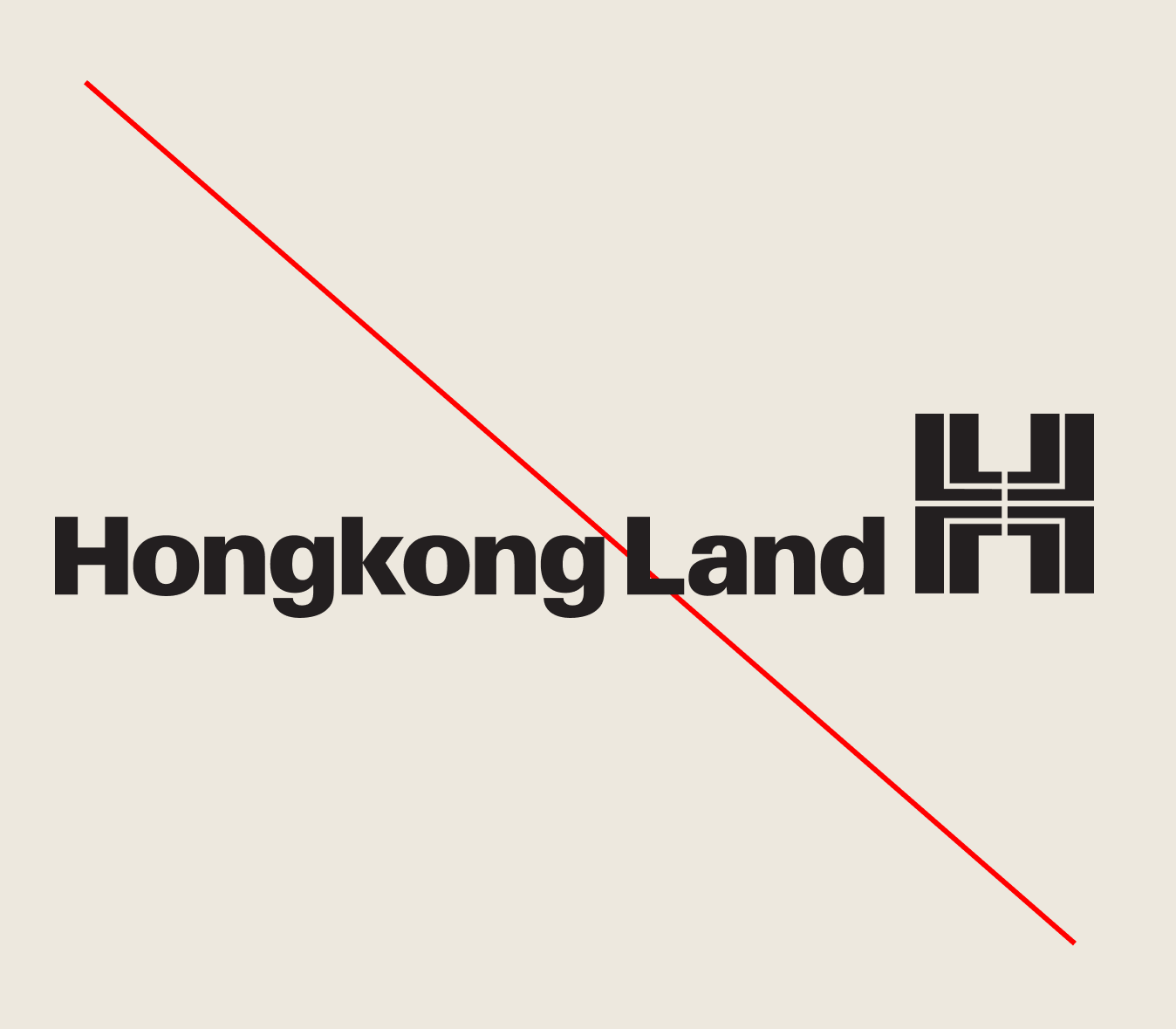
Our logo is composed of both our ‘H’ symbol and our wordmark. Our English wordmark is always present and an additional language can be used whenever relevant to the market it is being used in.
Usage must be approved by the corporate communications team.
Logo
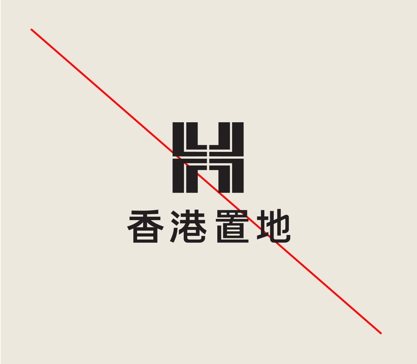
Language variations
The English wordmark is always present, no matter which logo variation.
The choice of logo should reflect the languages used within the application. For example, if the content is written in Traditional Chinese, use the Traditional Chinese version of the logo.

Logo
Animation
Our animated logo has been created for use in the dynamic digital world.
A dual-language version is also available for use.
Logo
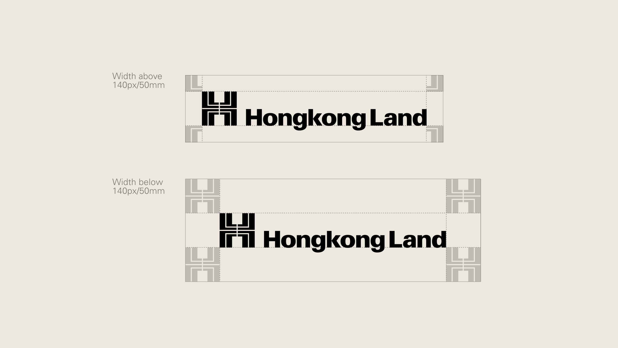
Clearspace
Avoid crowding our logo. When placing other elements nearby, ensure a minimum clearspace is used.
The amount of clearspace required is defined by the size of the logo used. This space will ensure sufficient distance from margins and surrounding elements.
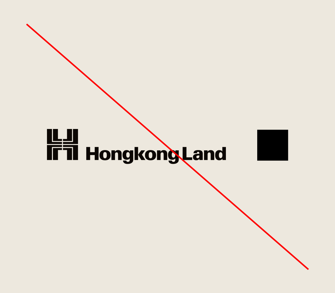
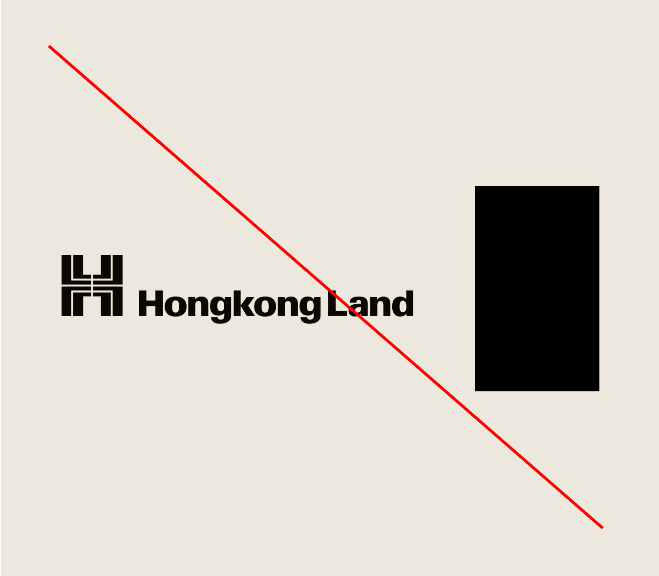
Logo
Scaling
The scale of our logo should be addressed on a case-by-case basis and depending on the application. However, please follow the below guidence to ensure the logo scale remains approproate across our identity.

The optimum logo height is equal to the height of the margin/logo clearspace.

The logo should not scale larger than 50% of the composition width.

The logo should not scale smaller than 25% of the composition width.
Logo
Minimum size
To ensure legibility and design integrity, the logo should not be scaled smaller that 35mm for print, and 80px for digital (width).

Logo
Positioning
There are three main positioning options for our logo. This offers flexibility when applying logos across various applications.
Logo
Colour
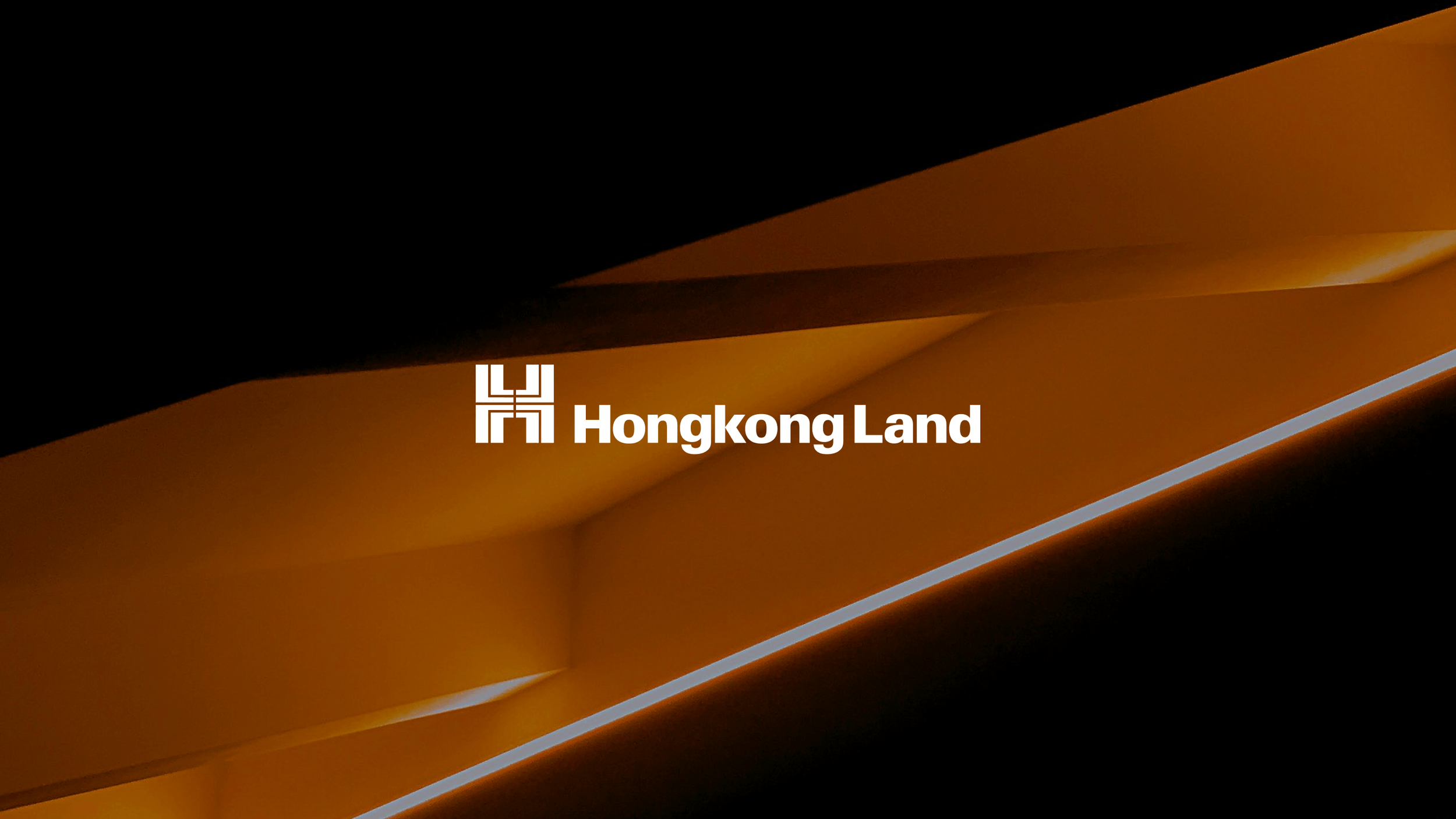
Our logo should only be used in colours from our neutral palette. It should predominantly be used in either Black or White.
When placed over imagery, choose a colour which will ensure sufficient contrast between the background and the logo.
Neutrals

Black on accent

White on accent

White on image
Logo
Misuse
To maintain consistency, the logo must not be altered, modified, or embellished in any way. Avoid any reinterpretation or distortion to preserve its integrity.
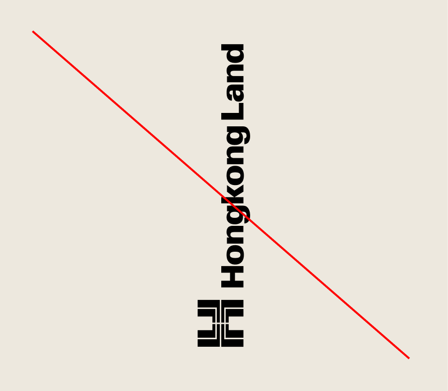
Do not place the logo on a vertical axis.
Do not use the wordmark without the symbol

Do not distort or warp the logo in any way.
Do not alter the lock up of symbol and wordmark
Do not use the logo as a framing device for imagery.

Do not apply a stroke to the logo.

Don’t add a trademark symbol to the logo

Don’t recreate the logo or make it italic
Logo
Lockup variations
The framework below outlines how dual language variations of the logo can be created. This system accommodates different languages, ensuring versatility while maintaining brand consistency.
The alternative language is always placed above the English wordmark. The English wordmark sets the overall width for the text area.

Lockup variations
To ensure consistency in the use of our logo, please avoid the following actions.
Avoid centered alignment of logotype and symbol

Do not reposition any part of the logo


Do not simplify or remove logo components
Logo
Partnerships
When partnering with another logo, maintain a visual balance in size between the logos, to ensure one does not appear dominant over another.
Always leave a gap equal to the width/height of our symbol between each logo.
Partnerships
Logo sizing


Don’t make a square logo the same height as our logo

Don’t use a logo at the same width if it is significantly taller
Don’t use the partner logo at more than 2.5x the height of our logo
Partnerships
Horizontal Construction


Partnerships
Horizontal Construction


Square logos should be roughly double the height of our logo

Wide partner logos should match our logo in width if they are a similar height
Vertical partner logos should have more height than our logo
Logo
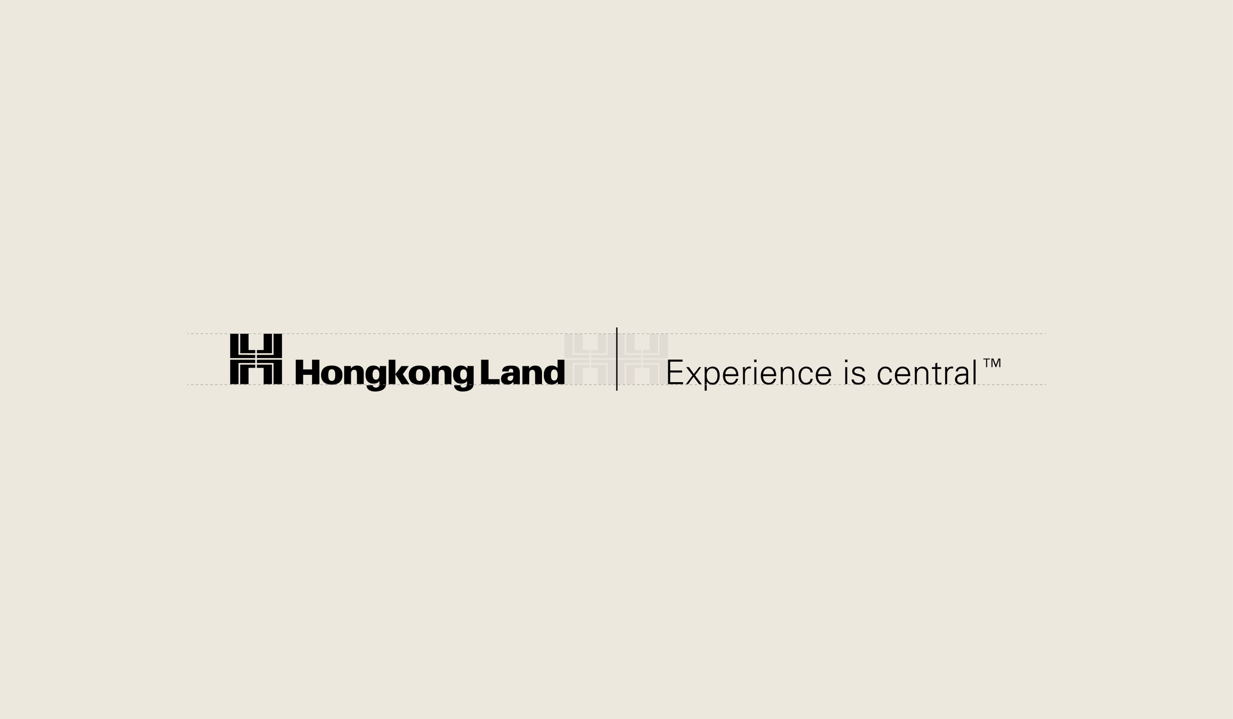
Logo and tagline
When placing the logo alongside our tagline, ensure the logo is the most prominent element. The tagline should be positioned in a supportive capacity.
Option 1:
The logo and tagline sit together on the same baseline and are separated with a keyline.
Option 2:
The tagline sits on the same baseline as the logo, but against the opposite margin.

Option 3:
The tagline is left aligned with the logo but sits on the opposite margin below it.

Logo
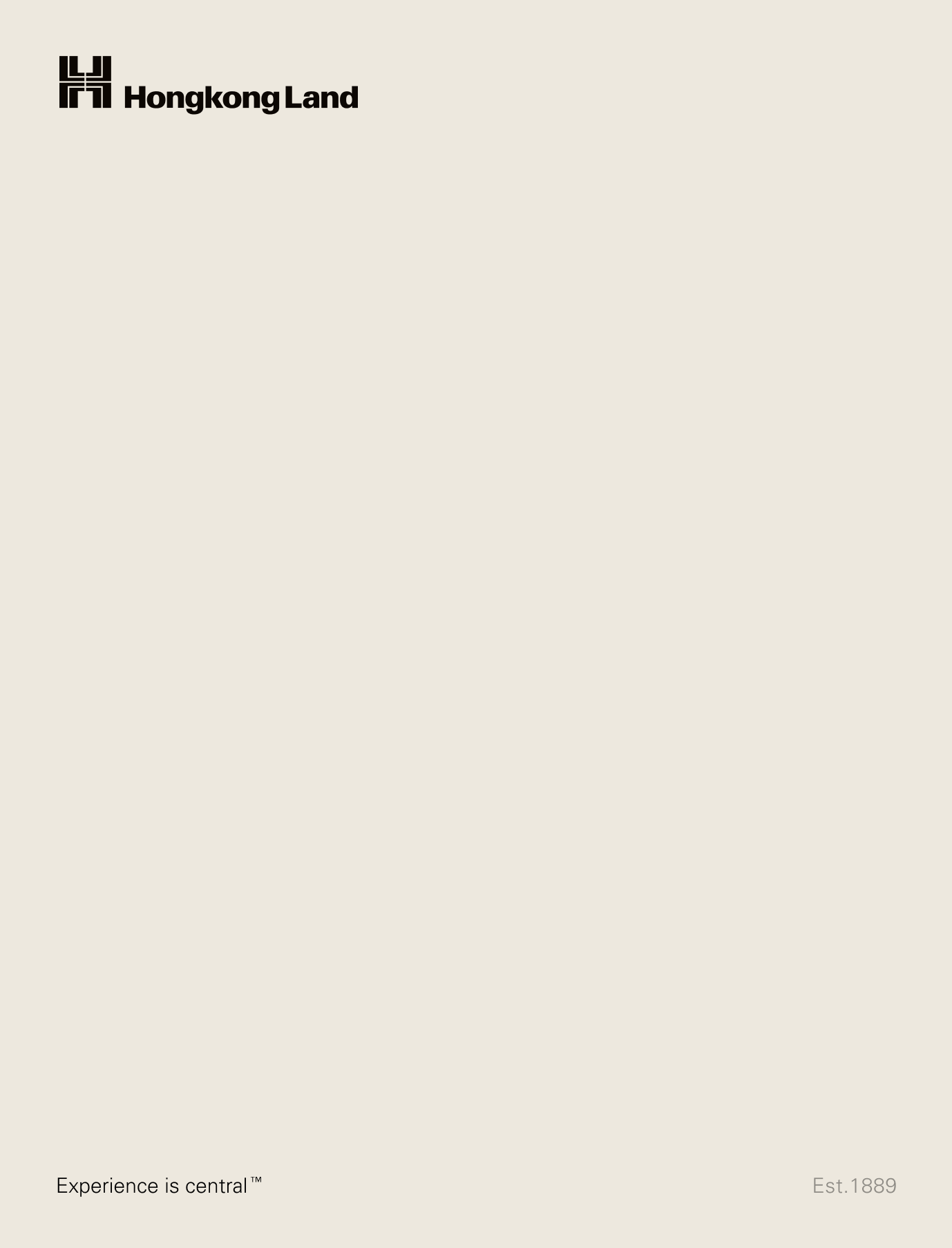
Est.1889
We celebrate our long and innovative history with the sign-off Est.1889. This does not need to appear in every application, but it gives us the ability to celebrate the length of our experience.
Option 1:
All the elements sit on the same baseline and are evenly spaced across the layout.

Option 2:
The tagline sits on the opposite margin to the logo, and the date sits on the same baseline as the tagline.
Logo
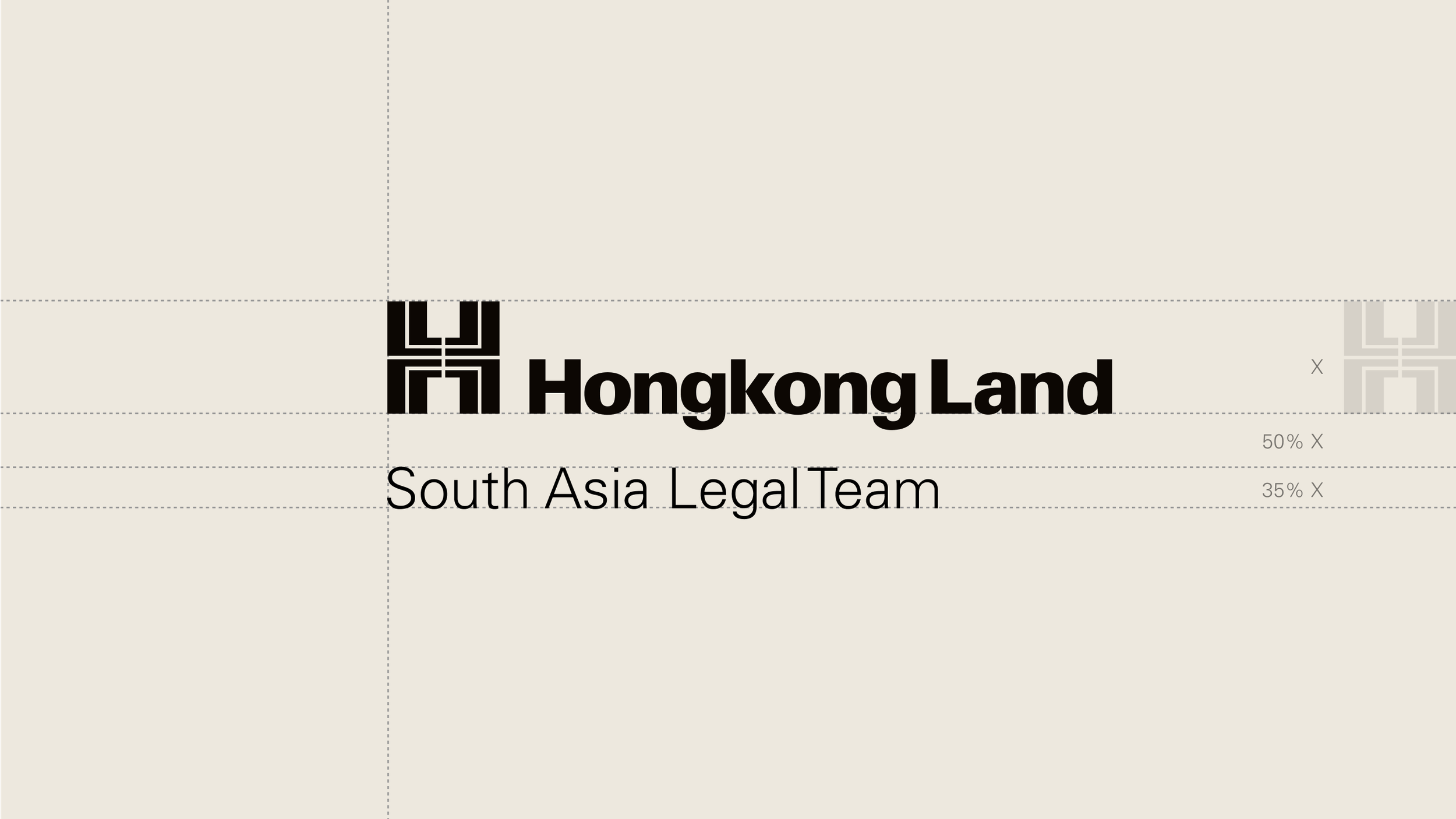
Department logos
When attaching a team or department name to our logo, reduce the spacing to 50% height of the logo and set the name of the team in Univers.
Logo
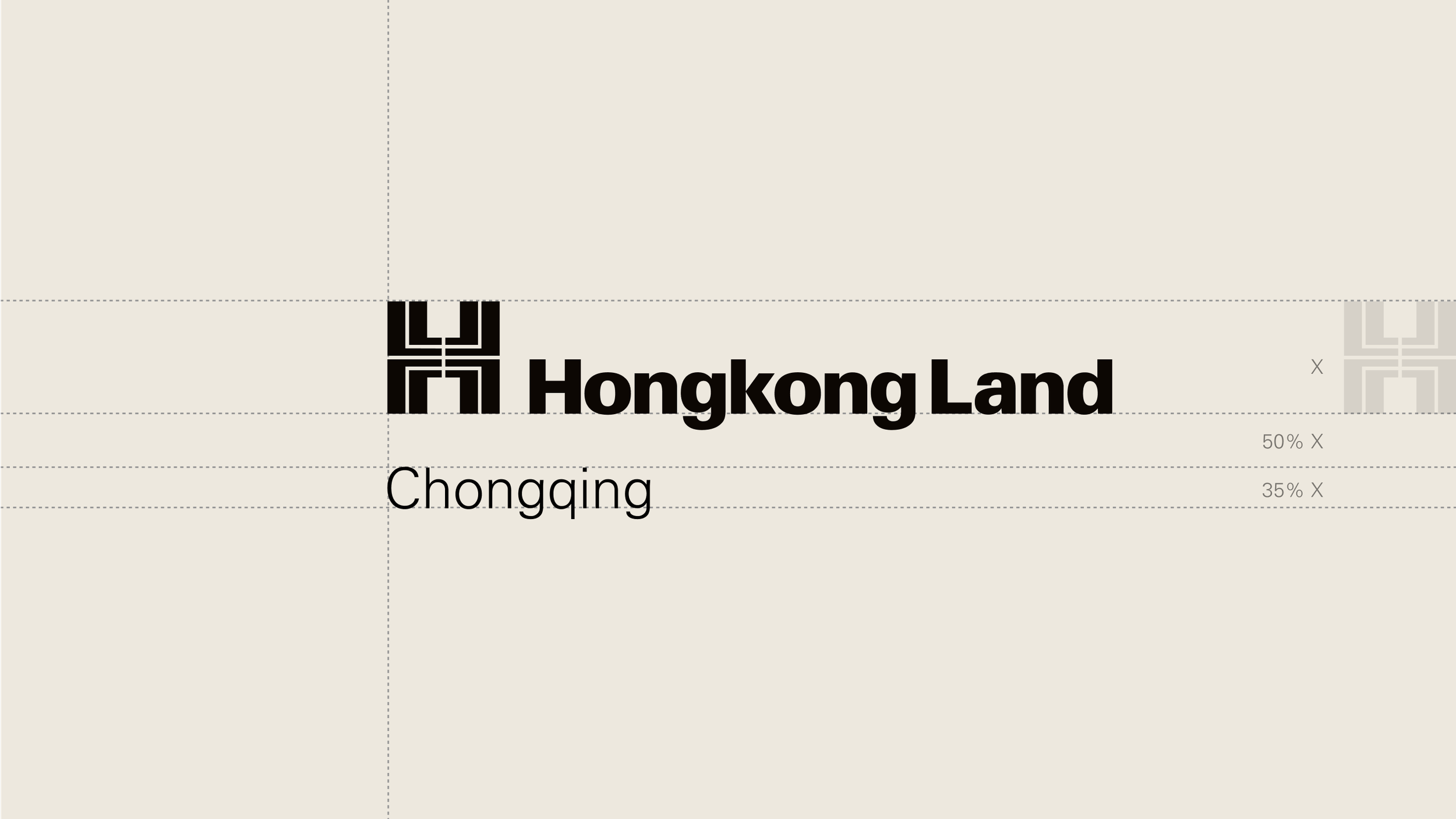
Regional logos
Logo only applications:
If creating an application which only uses the logo, the region name can be placed below the logo. When attaching a region to our logo, reduce the spacing to 50% height of the logo and set the name of the region in Univers.
All other applications:
If you are creating an application which contains more content than just the logo, you have two choices.
The first is to lock the region up to the logo as outlined above. This must however be the only use of the logo in the application. Never use more than one logo per layout.
The second option is to write Hongkong Land and the region name in Univers or Noto. This can then be used amongst the other copy present in the layout and should never be placed directly next to the logo.


Endorsement logos
For all endorsement logos and guidence please refer to our previous brand guidelines by clicking the button here.
Usage must be approved by the corporate communications team.
Property logos
For all property logos and guidence please refer to our previous brand guidelines by clicking the button here.
Usage must be approved by the corporate communications team.